Color Drenching: The Bold Paint Trick That Makes a Room Feel Expensive
What Is Color Drenching?
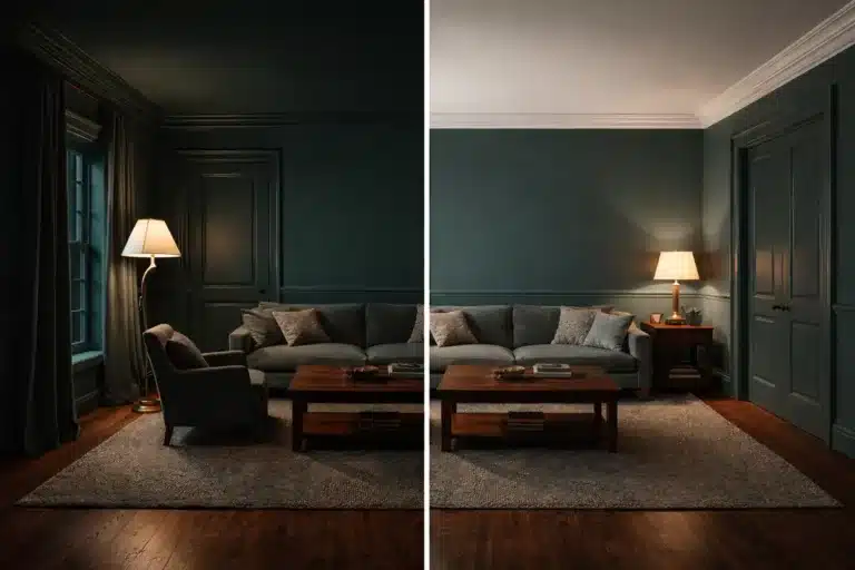
Color drenching is painting the walls, trim, and even the ceiling in one continuous color. The goal is a bold, immersive look that feels calm because high-contrast lines disappear.
It’s a modern technique that flips the usual painting rules on their head, and that’s why it reads so intentional when you walk into the room.
The first time you hear “paint the walls, trim, and ceiling the same color,” your brain does that little record-scratch thing.
Because we’ve been trained to treat trim like a border, ceilings like “safe white,” and contrast like a law of physics.
Color drenching breaks that rule on purpose. And when you do it right, the room stops looking “painted” and starts looking designed.

Why Color Drenching Works (and Why It Can Look High-End Fast)
1) It turns millwork into the feature
In homes with molding, paneling, beadboard, and detailed trim, one color doesn’t erase the architecture, it spotlights it. Shadows and edges do the talking.
2) It creates a cozy retreat feeling
When nothing is fighting for attention, your eyes relax. A color drenched room can feel like a quiet cocoon, especially in spaces meant for rest.
3) It instantly modernizes a space
You don’t see fully color drenched rooms in older design playbooks, which is exactly why it feels current. It’s a bold move that looks “designer” when it’s done with restraint.
4) It’s a big visual upgrade without a huge budget
A floor-to-ceiling one-color paint job can disguise tired walls and refresh a space for the cost of paint, not a renovation.

The Best Rooms for Color Drenching
If you want the biggest payoff with the least regret, start here.
Bedrooms, dens, nurseries, and studies
These are the rooms where calm matters. Color drenching works because it reduces visual noise and makes the space feel intentionally cozy.
Want it to look extra luxe? Match your drapes to the wall color. It creates that wrapped-in-fabric feeling that makes rooms look expensive.
Modern spaces with clean geometry
In modern rooms, color drenching highlights uninterrupted shapes and clean lines. One color makes the room feel sculptural, not busy.
Mudrooms, porches, laundry rooms, and hallways
These “in-between” spaces are perfect testing grounds. You get the bold look, the drama, and the refresh without committing your main living areas.

Is Color Drenching Timeless… or Risky?
Here’s the honest take: it’s modern, not traditional.
But modern doesn’t mean short-lived. It means you treat it like a tool.
If you choose the right room and the right color, color drenching looks deliberate, not trendy. If you do it in a space where you crave crisp contrast and visual separation, it can feel like too much.
So the real question isn’t “Is color drenching a fad?”
It’s: “Does this room want calm… or contrast?”

How to Color Drench a Room Without Regret
Step 1: Choose the right space (fast checklist)
Say yes if the room is:
- A bedroom, den, nursery, or study where you want a calm, cozy vibe
- A modern space where clean lines are the point
- A smaller, lower-budget space that needs a big visual glow-up
If none of those fit, skip to the “bold alternatives” section below, and you’ll still get a strong look.
Step 2: Pick your color with one question
Ask yourself: Do I want this room to feel like a hug or like a gallery?
- Hug: deeper, duskier, earthier shades (olive, ink, clay, deep teal, mushroom-toned neutrals)
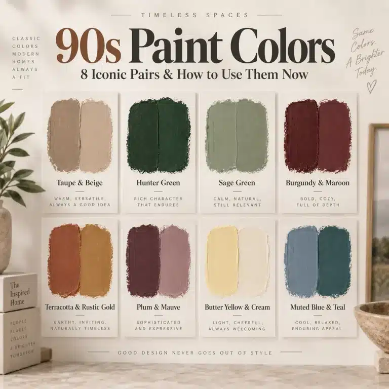
- Gallery: cleaner, crisper shades (smoky blue, blue-green, charcoal, moody plum and other 90s-inspired colors)
If you only like the color as an accent, don’t paint the entire room in it. Choose a softer version or start with a smaller space.
Step 3: Use one color, but not one finish
This is where color drenching goes from “painted” to “designer.” If you are ready to plan the supplies and finishing layer, see the Color Drenching Paint & Decor shopping edit.
A simple high-end formula:
- Ceiling: flat or matte (cuts glare)
- Walls: matte or eggshell (rich and forgiving)
- Trim and doors: satin (adds quiet definition without changing color)
You get depth and dimension without breaking the drenched effect.
Step 4: Match textiles for the full effect
If you want that wrapped, luxe look, match your drapes to the wall color. Add a textured rug and layered pillows, and the room suddenly feels like a set.
Step 5: Paint order that keeps it sane
- Ceiling
- Walls
- Trim and doors
- Touch-ups in daylight
Yes, it’s more work than a typical paint job. That’s why it looks expensive when it’s done.
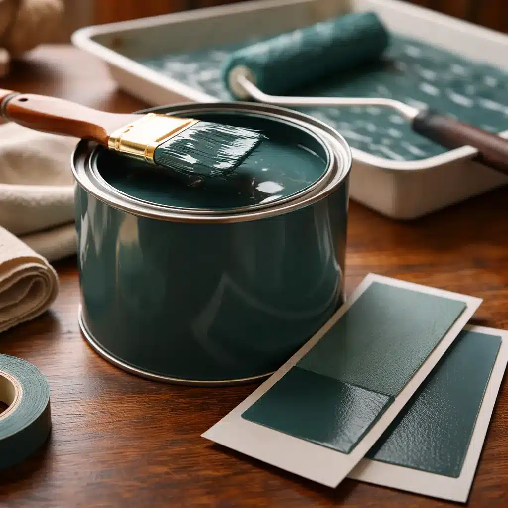
Shopping for the technique? I keep a separate Color Drenching Benable list with paint samples, brushes, rollers, extension tools, painter’s tape, multi-surface finishes, and texture pieces that fit this look. The list contains affiliate links, and I may earn a commission from qualifying purchases.
Common Mistakes That Make Color Drenching Look Off

Mistake 1: Doing it in a room with nothing to catch light
Color drenching shines when there’s shadow play: paneling, trim, texture, or architectural lines. If the room is a plain box, lean harder on finish changes, lighting, and texture.
Mistake 2: Skipping layered lighting
A drenched room needs lamps, warm bulbs, and light sources at different heights. If you rely on one overhead fixture, the color can feel heavier than planned.
Mistake 3: Choosing a color that fights your furniture
Color drenching doesn’t mean everything has to match, but your main pieces should feel at home in the mood you’re creating.

Want the Drenched Look Without Painting Everything?
If full color drenching feels like jumping off the high dive, these options still give you bold. For a lighter ceiling with the walls, trim, and doors still connected by color, see Cloud Capping Paint: How It Differs From Color Drenching.
Contrasting trim
Paint the trim a different color than the walls for a timeless, rhythmic look. This keeps definition while still feeling intentional.
Pattern drenching
Use matching wallpaper or fabric across more than one surface, like walls plus ceiling, or wallpaper plus drapes. It’s layered, luxe, and a little dramatic in the best way.
Statement ceiling
Keep walls calmer and go bold overhead with wallpaper, fabric, or a painted design. It draws the eye up and adds drama without committing every surface to the same color.

Quick FAQs About Color Drenching
Does color drenching make a small room feel smaller?
Not always. Low contrast can blur edges, and that can make a room feel calmer and sometimes even larger, especially with strong lighting.
Is color drenching only for dark paint colors?
No. It works with mid-tones and neutrals too. Dark colors just make the effect more obvious.
What’s the safest first room to try?
A mudroom, porch, powder room, hallway, or bonus room. You’ll get the impact without risking your most-used space.
How do I keep it from feeling flat?
Texture, finish changes, and layered lighting. Let trim and architecture create the depth.

The Easiest Way to Start (If You’re On the Fence)
Pick one “non-sacred” room and go all in: walls, trim, ceiling.
Then add one slightly extravagant detail: matching drapes, a chandelier, or one piece of art that looks a little too fancy for the space.
That one bold “why not?” choice is what makes the whole room feel intentional.
And once you see color drenching done right, regular paint jobs start to feel… loud.