Forget Greige: Mushroom Paint Is the Moody Neutral Making Homes Look Expensive
If you’ve ever stood in the paint aisle, holding a “safe” greige chip like it’s a life raft, I understand. I get it.
For years, we’ve been served the same three-course meal on repeat: beige, gray, stark white. It’s polite. It’s fine. It’s also… tired.
Enter the 2026 neutral that looks like it has a passport, a therapist, and a backup generator.
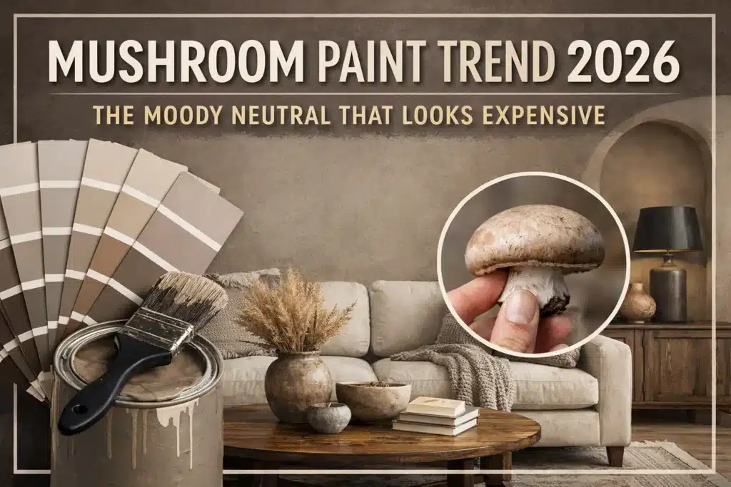
It’s called mushroom.

And yes, it’s exactly what it sounds like: earthy, grounded, a little misty, a little moody, and weirdly luxurious. Like greige grew up, moved out of the suburbs, and started baking sourdough for fun.
Let’s discuss what mushroom paint color really is. We will explore why it reads as expensive. Learn how to use it without ending up with “muddy sadness” on your walls.
What “Mushroom” Means (And Why It’s Not Just Another Neutral)
People hear “mushroom” and think: brown. Beige. Something flat.
Not this.
A true mushroom neutral lives in the space between taupe, greige, and beige, but it doesn’t behave like any of them.
Taupe and beige also sit at the center of the returning 90s paint colors palette, which helps explain why warmer neutrals feel familiar again without needing to copy an entire 1990s room.
Here’s the best mental picture:
You’re in the woods. You spot a mushroom. There’s soil on it. You brush it off. You hold it up to the light.
That soft, natural, stone-and-earth color you see? That’s the vibe.
Mushroom is a neutral with a little “organic grit” to it. Not dirty. Not dingy. Just real.
Greige is basically gray plus beige.
Mushroom feels like earth, stone, and morning fog got together and decided to make your home look custom.
The Magic Trick: Mushroom Has Shifting Undertones
This is why mushroom looks richer than the usual neutrals.
Most basic neutrals are one-note. You paint them. You get what you paid for. End of story.
Mushroom has layers.
Depending on the paint and the light in your room, you may notice:
- A soft green or olive cast that shows up in daylight
- Muted red or violet warmth borrowed from taupe
- A faint mauve haze in cooler versions
That undertone mix is what keeps mushroom from looking flat.
It doesn’t read “muddy.” It reads defined. Like there’s intention behind it. Like you hired someone who owns more than one measuring tape.
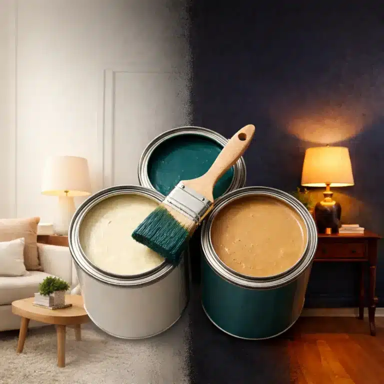
Mushroom Paint Changes Through the Day (So Test It Like You Mean It)
Mushroom is a chameleon, and that’s part of the appeal.
You’ll see it shift as the day moves:
- In bright daylight, it can lean slightly greenish
- In dim corners, it may pull mauve-gray
- At night, under warm bulbs, it often turns stone-warm and cozy
This is exactly why people fall in love with it… and also why people get surprised.
So here’s the non-negotiable rule:
Test it for 48 hours before committing.
Not a tiny chip. Not a cute little 6-inch square.
Do one of these:
- Paint a large swatch (at least 2 feet by 2 feet) on the wall
- Paint poster board and move it around the room
- Check it morning, afternoon, evening, and under your lamps
If a color has mood swings, you want to meet all its personalities before you marry it.
Mushroom vs Greige: Same Family, Different Energy
Greige is the neutral that wants everyone to approve of it.
Mushroom is the neutral that doesn’t care.
That’s why mushroom reads more expensive. It has depth. It has attitude. It looks intentional, not default.
Think of it like this:
- Greige: safe, smooth, agreeable
- Mushroom: soft, earthy, quietly bold, a little mysterious
Greige tries to blend in.
Mushroom makes the whole room feel styled, even if your sofa is still from 2014 and your coffee table is holding on by faith.
Why Mushroom Is Showing Up Now
We hit peak neutral burnout.
Cool gray had its moment. Now it often feels cold and clinical.
Plain beige has baggage. Some of us still remember 2005. The trauma is real.
All-white interiors can look gorgeous, but they’ve been copied so hard they’re starting to feel like a template.
Mushroom lands in that sweet spot:
Warm, but not yellow.
Soft, but not bland.
Moody, but not dark.
It gives you the calm backdrop people want from a neutral, with enough character to make the room feel finished.
Where Mushroom Looks Best in a Home
Mushroom is one of those rare colors that can play lead or supporting role. Here’s where it shines.
Living Rooms
Mushroom makes a living room feel calm and grounded, but still elevated. It pairs beautifully with linen, wool, wood, leather, and stone.
If your living room has lots of natural light, mushroom adds depth without making the space feel heavy.
Bedrooms
This color was made for bedrooms. It feels cozy, quiet, and a little cocoon-like, especially when paired with warm whites and layered textiles.
Hallways and Entryways
Hallways are often ignored, which is exactly why mushroom works there. It instantly makes the space feel “designed,” not like an afterthought.
Cabinets and Built-Ins
Kitchen and bathroom cabinets in mushroom tones look high-end fast. Especially with aged brass, matte black, or soft champagne hardware.
The Easiest Trim Pairings (Warm, Crisp, or Dramatic)
Because mushroom has undertones, trim color choice matters.
For a soft, warm look
Pair mushroom walls with warm whites like:
- Benjamin Moore Cloud White
- Benjamin Moore White Dove
This creates a layered, gentle contrast that still feels clean.
For a bolder, custom look
Try dark trim for a framed, architectural feel:
- Benjamin Moore Iron Mountain
- Benjamin Moore Black Beauty
This combo looks expensive in a way that’s almost unfair. Like the room suddenly got cheekbones.
Paint Colors to Sample for the Mushroom Look
If you want a good starting point, sample these:
- Benjamin Moore Callingwood: cooler-leaning, can read mushroom in the right light
- Benjamin Moore Gossamer Veil: lighter and airier, still earthy and balanced
- Farrow & Ball Cornforth White: refined and stone-like, with that quiet depth
These aren’t the only options, but they’re a solid first round of samples to help you spot what “mushroom” looks like in your home’s lighting.
How to Style Mushroom So It Looks High-End (Not Boring)
Mushroom already does a lot of the work. Your job is to pair it with textures and finishes that make it look intentional.
Here are easy wins:
Go heavy on texture
Think:
- linen curtains
- chunky knits
- bouclé chairs
- wool rugs
- woven baskets
- raw wood
Mushroom loves texture. It makes everything feel richer. Shop the warm-neutral room edit for linen, camel, walnut, stone, and antique-brass pieces that work with this palette.
Use contrast on purpose
Mushroom is one branch of a broader warm-neutral palette. For cream, taupe, sand, putty, soft stone, and wood pairings, see Warm Neutral Paint Colors: 7 Palettes Beyond Beige.
Mushroom looks stunning next to:
- black accents
- deep olive
- warm cognac leather
- charcoal
- soft clay tones
You don’t need a ton. Just enough to keep the room from feeling flat.
Add one “natural” focal point
A stone vase. A branch in a tall crock. A wood bowl. A ceramic lamp.
Mushroom is nature-coded. Give it something to talk to.
The Quick “Don’t Ruin It” Checklist
Before you paint the whole house, run through this:
- Are your bulbs super cool (5000K daylight)? Mushroom can look a little gray-green. Warmer bulbs usually flatter it.
- Do you have a lot of green outside your windows? That reflection can boost the green undertone.
- Is the room very dark? Choose a lighter mushroom, or it can feel heavier than you wanted.
- Did you test it at night? You live in your house at night. Don’t skip that part.
A Neutral With Soul
Mushroom isn’t a trend that screams for attention.
It’s the kind of color that makes people walk into your home and pause for a second like, “Wait… why does this feel so good?”
It’s grounded. It’s grown-up. It makes basic furniture look better. It makes a room feel intentional without begging for compliments.
If you’re ready to move past greige and pick a neutral with depth, mushroom is your 2026 answer.
If you want an easy next step: grab three sample pots, paint big swatches, and watch what happens over two days. One of them is going to hit that “expensive calm” note, and once you see it, you can’t unsee it.