
How to Choose Paint Colors to Brighten a Dark Room
A Quick “Pick Your Paint” Cheat Sheet for Dark Rooms
If you want a simple way to choose paint colors for low light, start here:
- Room feels cold and gray: choose warm undertones (creamy whites, warm greige, soft beige)
- Room feels small and choppy: consider color drenching
- Room has almost no natural light: go richer and make it cozy (deep clean color + great lighting)
- Room has one small window: skip stark white, try soft warm white or light greige
- Room looks fine in daytime but weird at night: check your bulbs (CRI 90+ helps a lot)

The Dark Room Dilemma
Every home has one room that natural light seems to ghost.
Maybe it’s a north-facing living room that never looks “awake.” Maybe it’s a hallway that feels like a tunnel. Maybe it’s a bedroom shaded by trees, a neighboring house, or a deep overhang.
So you do what almost everyone does. You grab the brightest white you can find. You hope it’ll bounce the light and magically make the room feel bigger.
And then… it looks gray. Dingy. Sort of cold. Like the room is wearing a hospital gown.
If you’ve ever thought, “Why does this white look sad?” you’re not imagining it.
Brightening a dark room isn’t about picking the lightest paint color. It’s about picking the smartest one.
Here are five designer secrets. They can change how your darkest room feels. You don’t need to rip out windows or blow up your budget.
1) Stop Reaching for Pure White
Pure white feels like the “correct” answer. It also fails a lot in dim spaces.
Here’s why: white needs light to look white.
A paint’s Light Reflectance Value (LRV) runs from 0 (black) to 100 (white). Many bright whites sit around the mid-80s to low-90s. That sounds perfect, until you remember what LRV really means: potential to reflect light.
If the room doesn’t have much light to begin with, there isn’t much to reflect. Instead of appearing clean and airy, that “bright white” starts picking up shadows. It goes gray, flat, or slightly lifeless.
Color expert Ellen Divers explains it simply: light colors reflect more light. However, in a low-light room, there isn’t much light available. Pale colors can end up looking gloomy and gray in such conditions.
What to do instead:
- Choose an off-white with a warm base. Think creamy, soft, gentle.
- Skip whites that lean icy, blue, or “sharp.”
- Avoid muddy undertones (they can go swampy fast in dim light).
A quick rule that saves regret:
If your room feels cold already, a cool white usually makes it colder.

2) Use Rich, Saturated Color and Make the Darkness Work for You
This is the part that feels wrong… until you see it done.
One of the quickest ways to enhance a dark room is to stop trying to achieve a “bright and airy” look. Instead, aim for a “cozy and expensive” feel.
Deep, saturated colors can make dim spaces feel intentional. Like a retreat. Like a room with a point of view.
Think:
- Deep navy
- Forest green
- Warm terracotta
- Inky teal
- Chocolate browns with warmth
- Mushroom paint colors
These shades don’t rely on sunlight to look alive. They create depth. They soften shadows. They make your lamp light feel golden and flattering, especially at night.
There’s a catch: not all dark paints behave the same.
Look for “clean” saturated color.
Skip colors that look like they have a lot of black mixed in. Black-heavy bases can swallow light and make a room feel smaller. Cleaner pigments hold their color better even in shadow.
Lighting tip: It matters more than people think.
Use bulbs with a CRI of 90+ so your paint doesn’t look dull or “off.” High CRI lighting shows color more accurately, which is exactly what you want when natural light is limited.
If you’ve ever painted a room and thought, “This looked better at the store,” the lighting in your room was likely the reason. It was probably telling the paint a different story.

3) Look Up: Your Ceiling Can Bounce Light Like a Mirror
Most people paint the ceiling flat white and move on.
Designers see the ceiling as a cheat code.
In a darker room, the ceiling is a huge surface that can throw light back into the space. The trick isn’t just the color. It’s the finish.
A glossier ceiling (think satin, high-gloss, or lacquered look) can catch light from lamps and windows and bounce it around. It creates a subtle reflective effect that makes the room feel brighter and taller.
It also adds a little “jewelry box” polish. The ceiling starts behaving like part of the design. It is no longer a forgotten blank.
Reality check before you commit:
Gloss shows every bump and patch. If your ceiling has texture or flaws, prep matters. If you want a softer version of this idea, try satin instead of full gloss.
One more ceiling trick that’s easier:
Paint the ceiling the same color as the walls, just in a flatter finish. You get a softer edge, less contrast, and a calmer feel.

4) Master Undertones (This Is Where Dark Rooms Get Tricky)
If you want to know how to choose paint colors to brighten a dark room, pay attention. This is the part most people skip.
Undertones matter everywhere. In low light, they run the show.
The light in your room has a “temperature,” and your paint will react to it.
North-facing rooms
These get cool, bluish light most of the day. If you paint them with a cool gray or a crisp blue-white, the room can feel chilly and bleak fast.
Better choices:
- Warm whites (creamy, soft)
- Greige with warmth
- Beige with a hint of pink or yellow
- Soft tan neutrals
Benjamin Moore Simply White (OC-117) is famous for a gentle warmth that can help balance cool light. Swiss Coffee (OC-45) can read creamy and cozy in spaces that need softness.
South-facing rooms
These often get warmer light. Warm paint can look extra yellow in that glow.
Better choices:
- Cleaner whites
- Slightly cooler neutrals
- Balanced greiges that don’t go buttery
East-facing rooms
Bright morning light, then it cools off later. Test paint at breakfast and dinner.
West-facing rooms
Dim mornings, warm afternoons, then golden evening light. Colors can look very different across the day.
The test that prevents heartbreak:
Paint sample swatches at least 2×2 feet (bigger is better). Put them on multiple walls. Watch them across a full day and at night with your lamps on.
Small paint chips lie. Big samples tell the truth.
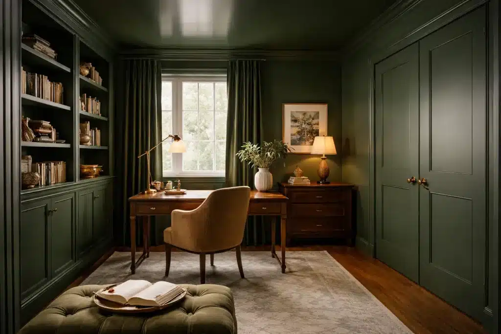
5) Erase the Boundaries With Color Drenching
Want a dark room to feel bigger without changing a single wall?
Stop chopping it up with contrast.
Color drenching means painting:
- walls
- trim
- doors
- and often the ceiling
all the same color.
When your eye can’t “see” the edges, the room feels smoother and more spacious. Your brain stops reading the corners and breaks. The space feels more wrapped, more calm, more intentional.
This works beautifully in:
- hallways
- offices
- powder rooms
- snug bedrooms
- small dens
The pro move: vary sheen, not color.
Same color everywhere, different finishes:
- matte or flat on ceiling
- eggshell or satin on walls
- semi-gloss on trim and doors (for durability)
You get dimension without harsh contrast.
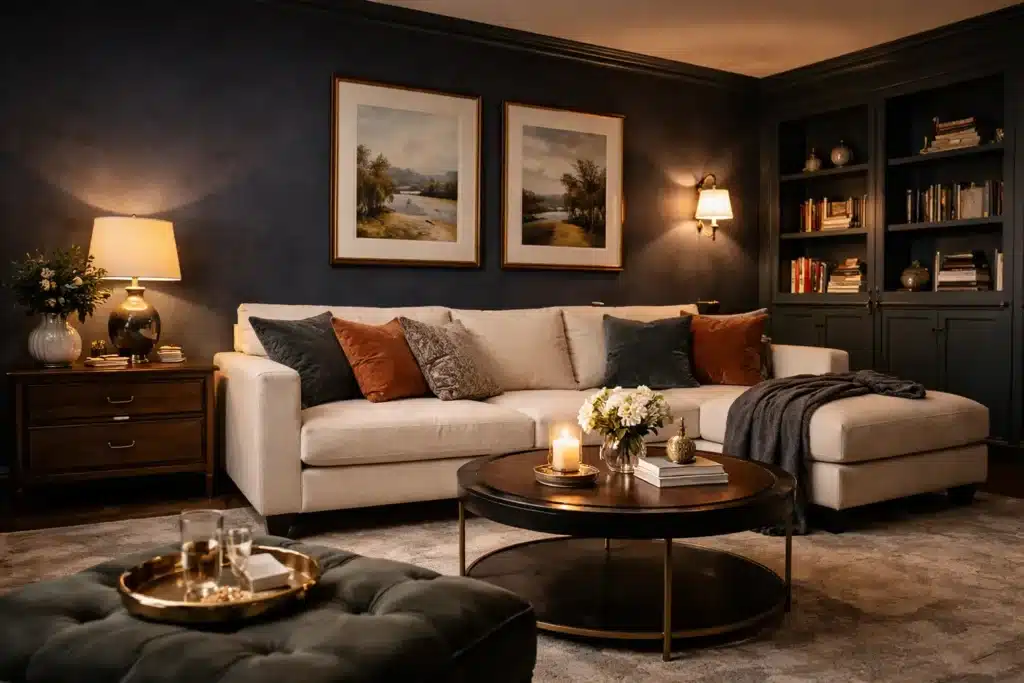
Make Your Dark Room Feel Like a Feature, Not a Flaw
A dark room doesn’t need to be “fixed.” It needs the right plan.
When you stop chasing the brightest white, the room stops feeling tired. Start choosing undertones, saturation, sheen, and lighting with intention.
It starts feeling designed.
So tell me, which rule are you ready to break first? Is it ditching pure white? Is it going moody with deep color or glossing the ceiling? Or are you considering color drenching the whole space?