How to Pick Paint Colors That Look Right in Your Room’s Light
How to Pick Paint Colors: A Simple 60-Second Method
If you want the shortest path that still works:
- Identify window direction
- Choose your strategy: brighten or moody
- Pick 3–5 candidates with the right undertone for that light
- Check LRV if the room is dark
- Sample big, on multiple walls, day and night
Do that, and you won’t be repainting a room because the “perfect color” looked like a totally different color once it dried.
Your Cheat Sheet: Pick a Strategy, Then Pick a Color
| Strategy | Goal | Best For | Color Approach |
|---|---|---|---|
| Brighten It Up | Make a room feel brighter, larger, more open | North-facing rooms or spaces with limited natural light | Use higher LRV paints plus warm undertones (yellow, pink, beige) to fight cool light and shadow |
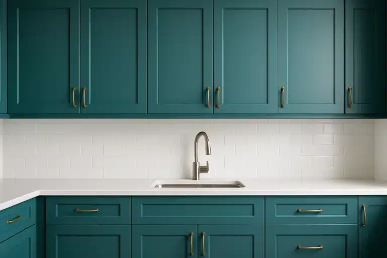
| Embrace the Mood | Make the room feel cozy, intimate, dramatic | Bedrooms, dens, powder rooms, evening spaces | Use rich, saturated colors (jewel tones, earthy greens, deep navies) so the dimness feels intentional |
Have you ever picked a “perfect” paint color in the store… then watched it turn weird on your wall?
That warm greige suddenly looks purple.
That clean white suddenly looks gray and tired.
That “soft beige” suddenly looks like wet cardboard.
If you are working with warmer neutrals, sage, burgundy or deep green, see how those 90s paint colors behave in updated rooms before you commit to a full wall.
You’re not imagining it. Your paint isn’t betraying you. Your light is.
If you want to know how to pick paint colors with confidence, you have to stop treating light like it’s neutral. Natural light has a color to it. It leans warm or cool, and it changes based on which direction your windows face. That light hits your paint’s undertone (the quiet little hue hiding under the main color) and changes what your eyes see.
Once you understand that, picking paint stops being a gamble and starts feeling… unfairly easy.

The Golden Rule: A Light Color Won’t “Save” a Dark Room
Here’s the mistake almost everyone makes:
They walk into a dim room and think, “Cool. I’ll paint it bright white. Problem solved.”
But in low light, bright white doesn’t glow. It sulks. It reflects shadows and goes flat, gray, and dingy. As Donald Kaufman has said: “A light colour will never come to life in a dark room.”
So when you’re learning how to pick paint colors, you’re really choosing between two smart plays:

Strategy 1: Brighten It Up
You’re trying to make the room feel lighter, bigger, cleaner.
Your best friends here:
- High LRV paint (Light Reflectance Value), which measures how much light a color bounces back into the room
- Warm undertones (yellow, pink, beige) that fight the cool shadowy cast in dim spaces
LRV, fast:
LRV runs from 0 (absorbs light) to 100 (reflects a ton of light). Higher LRV can help a room feel more open, as long as the undertone is right.

Strategy 2: Embrace the Mood
You stop trying to “fix” the room and make it a vibe on purpose.
This is how you get that cozy, dramatic, jewel-box feel where the room looks expensive at night and intentional all day.
Your best friends here:
- Deep, saturated colors
- Rich undertones that look warm even in low light
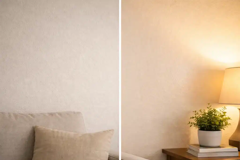
Quick Tip: Sheen Changes Everything
Paint finish affects how light behaves.
- Satin or eggshell reflects more light than matte, so it can help in darker rooms
- Matte hides wall flaws and looks gorgeous with deeper colors, giving that velvety, high-end feel
Now let’s get practical.

How to Pick Paint Colors Based on Window Direction
If you do nothing else, do this: figure out which direction the room faces.
Stand in the room, face the window, and note the direction.
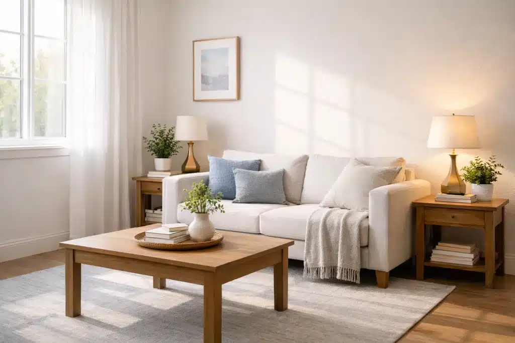
North-Facing Rooms: Cool Light, Soft Light, Sneaky Light
The light: consistent, indirect, muted… with a cool blue-gray cast.
The problem: it flattens color and makes rooms feel chilly. Cool grays and icy tones can look sad fast.
The move: add warmth to cancel out that coolness.
Paint colors that usually win in north light:
Warm whites and off-whites
A pure white can look clinical. Choose a white with warmth so it reads like “soft daylight,” not “dentist office.”
- Simply White (LRV 89.52) is a great example of a warm-leaning white that helps a dim room feel more alive.
Warm neutrals (greige, warm gray, soft taupe)
These are the “chameleon” picks that shift gracefully with decor and don’t go icy in north light.
- Pale Oak (LRV 68.64) is a solid example of a soft warm gray that stays calm instead of turning blue.
Moody, saturated hues with warm undertones
North light can make a dark room feel like a cave… or like a chic little hideout.
- A deep navy with a green pull, like Hague Blue, can feel rich and cozy instead of cold.
North-facing shortcut:
If it looks a little too warm on the sample card, it often looks just right on your wall.
South-Facing Rooms: Bright, Warm, and Loud (In a Good Way)
The light: strong, bright, warm, golden most of the day.
The problem: warm colors can look extra yellow, and some colors can get washed out.
The move: use cooler tones to balance the warmth.
Paint colors that usually win in south light:
Cool whites
Clean whites with neutral-to-cool undertones stay crisp instead of going buttery.
Cool grays and blues
South light makes them feel welcoming, not icy. Soft blues and cooler grays can look amazing here.
Deep, cool colors
South-facing rooms can handle drama because they have enough light to show depth. Deep navy, emerald, charcoal with cool undertones can look expensive fast.
South-facing shortcut:
A color that feels “a bit too cool” on the chip often becomes balanced in this light.

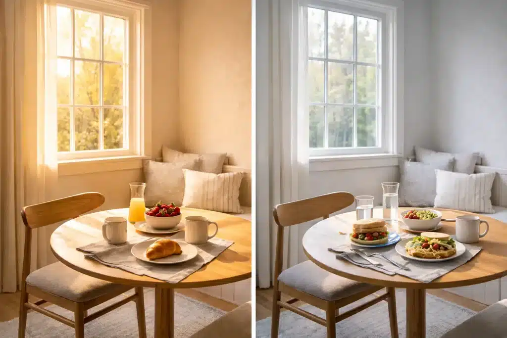
East-Facing Rooms: Warm Morning Glow, Cooler Afternoon Shift
The light: bright and warm in the morning, then cooler and shadowy later.
The problem: the same paint can look cheerful at breakfast and dull by late afternoon.
The move: choose based on when you actually live in the room.
If you use it mostly in the morning (kitchen, breakfast nook):
Warm colors can look incredible in that morning glow.
If you use it all day:
Pick colors that still look good when the room cools down later.
- Greens and blues tend to hold steady: energized in morning light, calmer in the afternoon.
East-facing shortcut:
Test the color after 3pm. That’s when the “truth” shows up.
West-Facing Rooms: Cool Morning, Intense Golden Hour at Night
The light: cooler earlier in the day, then big warm sunset light later.
The problem: warm colors can get fiery and overpowering at night, yet look flat in the morning.
Two good options:
Option A: Balance the evening heat
Cooler hues (blues, blue-greens, some neutral whites) keep sunset light from turning your walls into a toaster oven.
Option B: Lean into the glow
West light can make deeper colors look insanely good at night.
- Deep twilight blues like Blue Fjord
- Rich coral reds like Granada
West-facing shortcut:
Test your paint with lamps on. West rooms are often used at night, and warm bulbs can shift your color fast.

Undertones: The Tiny Detail That Makes Paint Look “Wrong”
If you want to master how to pick paint colors, you need one skill: spotting undertones.
Two paints can look identical on a swatch… then one turns lavender on the wall. That’s undertone showing itself under your room’s light.
A quick way to see undertones:
- Put your paint chip next to a true white sheet of paper
- Then next to a true gray chip
You’ll start to see whether it leans pink, green, yellow, blue, violet.
And once you see it, you can’t unsee it. (It’s like realizing your friend always interrupts. Painful. Useful.)

Related palette guides: If you are choosing among low-saturation colors, compare Warm Neutral Paint Colors. For warmer wood-heavy rooms, see Rustic Farmhouse Paint Colors. If you want the wall, trim, doors, and ceiling to work as one color story, see the Color Drenching guide.
The Step Most People Skip: Test Paint Like You Mean It
A tiny paint chip is a liar. It’s too small, and your brain “fills in” the missing context.
If you want to know how to pick paint colors without regret, test the color the way it will live.
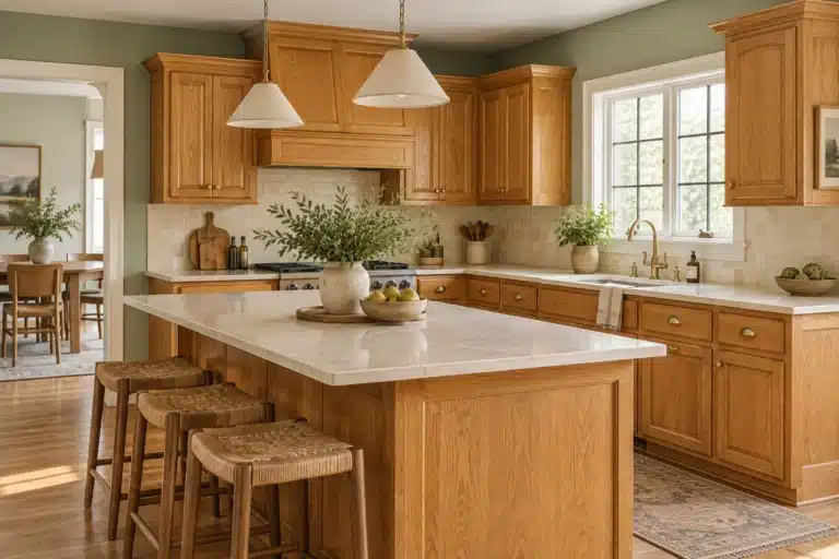
Keeping your golden wood cabinets? Compare our six paint palettes for honey oak cabinets, then test your finalists beside the countertop and backsplash.

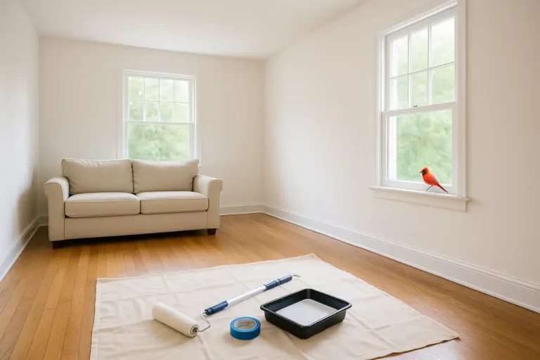
1) Go big with samples
Buy sample pots and paint large swatches at least 2 to 3 feet wide.
Even better: paint a foam poster board. Then you can move it around the room like you’re interrogating it under different lighting. (Which… you are.)
2) Test more than one wall
Put one sample where it gets the most natural light. Put another where it stays shadowy. That contrast is the whole game.
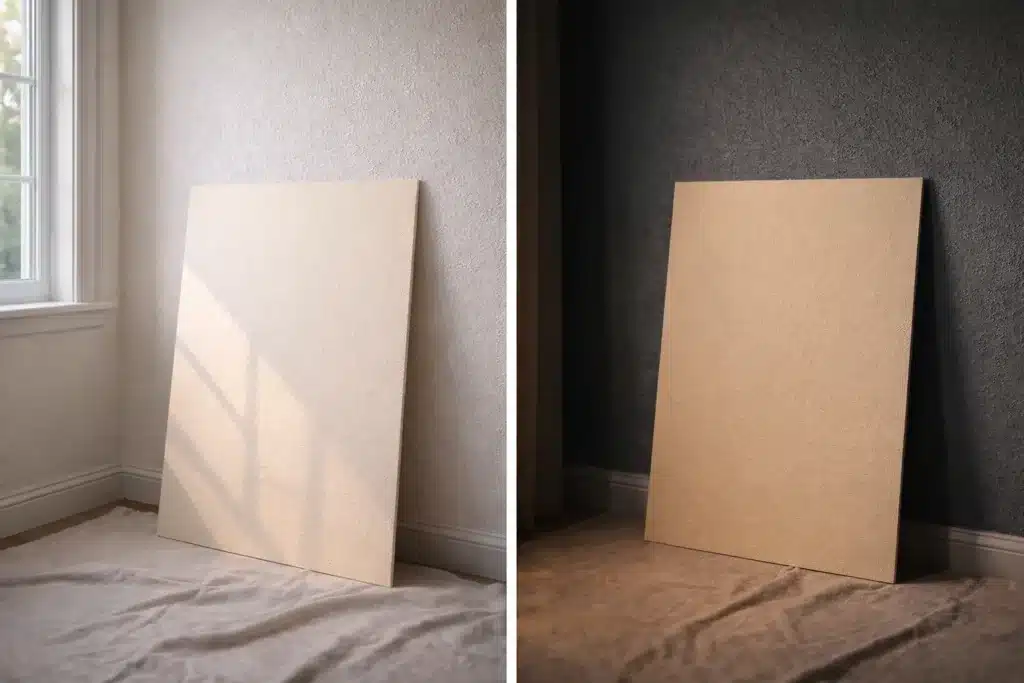
3) Watch it for a full day
Morning. Midday. Late afternoon. Night.
A paint color can look like three different personalities depending on the hour.
4) Turn on your lights at night
This is where the “why is my beige purple” panic happens.
Artificial bulbs have their own tone. Warm bulbs can push paint more yellow, pink, or muddy. You need to love the paint under lamps, not just daylight.