Ivory, Gray or Charcoal Grout? Compare the Same Tile Before You Choose
With warm-white bathroom tile, ivory grout is a useful starting point for a quiet surface, gray for a softer visible outline, and charcoal for a graphic grid. The best choice depends on the actual tile, joint width, lighting, and how much pattern you want. Our small bathroom tile guide covers the overall room; this comparison helps you choose the grout without changing several variables at once.
Compare cured samples of the same tile, layout, and joint width before ordering. “Ivory,” “gray,” and “charcoal” are color families here, not standardized shades across brands. A screen image can narrow your preferences, but it cannot approve the final installed color.
What Changes When You Change Only the Grout?
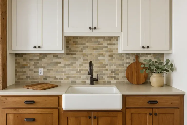
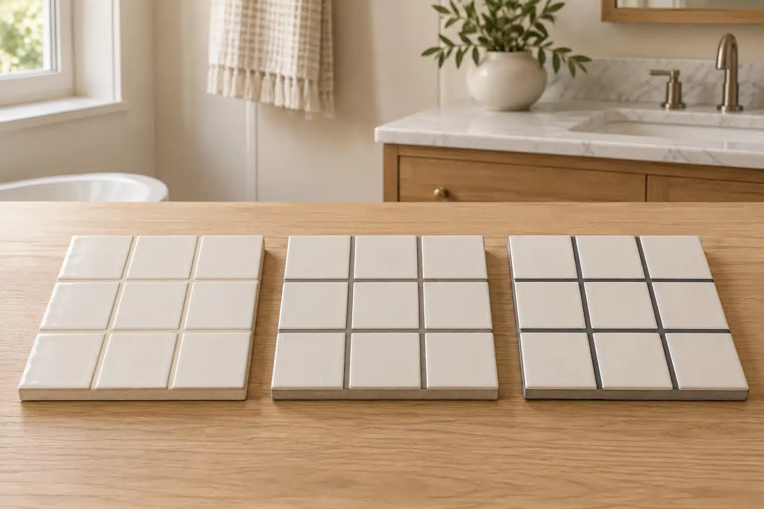
Imagine the same warm-white rectangular tile in three sample panels. Ivory can let the tile faces dominate. Gray can make the arrangement easier to see without drawing the strongest outline. Charcoal can make each tile and intersection a more deliberate part of the room.
Which effect is preferable depends on the competing details. If the floor, vanity, and wallpaper already provide pattern, a quiet wall tile may be useful. If simple tile is intended to be the main feature, a stronger joint can give the layout more presence.
| Grout Family | Design Direction | Most Useful When | Check Before Choosing |
|---|---|---|---|
| Ivory | A softer, more continuous tile field | You want the vanity, stone, or other finishes to lead | Does it look too yellow beside the tile, sink, or tub? |
| Gray | A visible but less emphatic outline | You want to read the layout without a stark grid | Does the actual gray lean blue, green, or brown? |
| Charcoal | A strong graphic outline | The tile pattern is meant to be a focal point | Do you like every joint and edge being more noticeable? |
CUSTOM Building Products’ grout color guidance explains that matching grout reduces visual contrast, while contrasting grout emphasizes the layout and can make installation variation more apparent. Choose the effect you want before choosing the exact shade.
Look at the Tile Edge, Not Just Its Center
Grout meets the edge of the tile. A warm-white center with a darker edge or glaze variation may create more of an outline than a product photograph suggests. Lay out several tiles from the actual material you plan to install and compare their variation.
With handmade-look or irregular-edged tile, ask whether you like the uneven rhythm of the joints. Charcoal can make that rhythm a feature. A closer color can make the tile surface feel quieter. Neither choice will change the physical accuracy of the installation.
For patterned tile, compare the grout with the background and with a secondary color. Matching a small dark detail can create a much busier overall grid than matching the background. Step back to the doorway distance before deciding.
Keep Joint Width and Layout Constant During the First Test
A comparison is difficult to interpret if the ivory sample uses narrow joints and the charcoal sample uses wide joints. Use the intended joint width for all three. Confirm that width with the tile and grout instructions and the installer before making the boards.
After choosing a color direction, you can compare another permitted width if you still need to decide. Treat that as a second experiment. Do not shrink a joint below the installation requirements just because the wider dark line feels too strong.
Tile size matters visually too. A small mosaic repeats joints much more often across a wall than a large rectangular tile. A contrast you enjoy on a single tile can become a dominant pattern when repeated. Our tile layout guide can help you assess that repetition before the material is ordered.
Make Three Useful Samples Before Approving the Color
This is Cardinal Decor’s suggested comparison method. It is a design test, not a replacement for the tile, grout, or waterproofing system’s installation instructions.
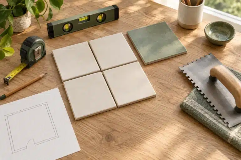
- Gather the exact materials. Use the tile, grout product line, and candidate colors you intend to buy. Include any specified tile pretreatment in the mock-up.
- Repeat enough of the pattern. For small rectangular tile, several rows with more than one vertical joint are more revealing than a single cross-shaped joint. Include the offset if you plan a staggered layout. A mosaic sample should include a sheet-to-sheet junction.
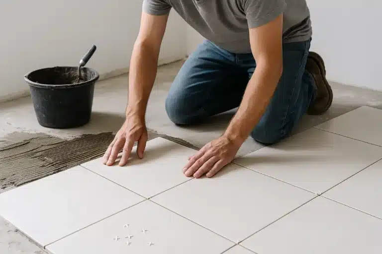
- Build comparable panels. Keep tile orientation, joint width, and preparation consistent. Ask the installer to prepare them if you are hiring the installation out.
- Label each panel. Record the manufacturer, exact product, shade name and number, joint width, and date made. Similar names in different product lines are not a reliable specification.
- Wait for the product’s required cure. Use the instructions for that exact grout and conditions. Do not approve the color from loose powder, a wet mix, or a freshly washed joint.
- View them in the room. Compare a wall sample vertically and a floor sample horizontally, using daylight and the normal bathroom lighting.
CUSTOM notes that displayed colors are approximate and installed shade can vary with the tile, conditions, and finishing method. Its guidance also distinguishes fresh grout from the cured result. That is why a physical mock-up is more valuable than ordering directly from an online swatch.
Judge the Panels From Three Distances
From the doorway: decide where your eye goes first. Is it the vanity, the tile texture, or the grout grid? This is the most useful view for judging the room’s overall balance.
From normal use distance: stand where you use the sink or sit in the bath. Check the grout with the countertop, mirror, and fixture finishes visible. A gray that looked neutral on its own may feel different beside warm stone.
Close up: inspect edges, surface residue, and the joint finish. A color you like from across the room still needs a clean, compatible installation. If the tile is porous, textured, or easily scratched, ask the manufacturer and installer to confirm the selected grout and cleanup method before proceeding.
| Question | Record for Each Sample | Why It Helps |
|---|---|---|
| Where does my eye go? | Tile surface, joint grid, or another room feature | Shows whether the grout supports the intended focal point |
| Does the shade fit the room’s whites? | Compare with tile, sink, tub, and wall sample | Catches an unwanted yellow, blue, or green relationship |
| Do I like the repeated pattern? | Check several rows or sheet joints | Avoids approving a single tile that becomes busy across a wall |
| Is the installation clean? | Note residue, staining, scratches, or uneven joints | Separates color preference from a product or technique problem |
Which Would You Choose in Three Common Bathrooms?
A Warm Bathroom With an Oak Vanity
Start by comparing ivory and a warm gray beside the vanity and countertop. Ivory may support a soft, continuous wall; gray may give the tile enough definition to avoid a washed-out appearance. Keep a charcoal sample in the comparison only if you want the tile grid to compete with or echo darker details elsewhere.
If ivory looks too creamy beside a bright white sink, test a less yellow shade within the approved grout line. You do not need to jump directly from ivory to charcoal.
A Simple Bathroom With Black Fixtures
Charcoal is worth sampling if you want a graphic scheme, but black fixtures do not require dark grout. Try a softer gray as well. It may connect with the fixtures while leaving the tile less dominant.
Repeat the full tile arrangement in the sample. A bold joint around a stacked rectangle reads differently from the same joint in a herringbone pattern. Let the room’s intended focal point settle the choice.
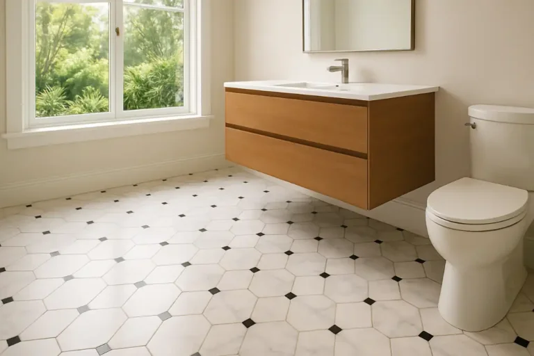
A Small Bathroom With a Patterned Floor
Try lower-contrast grout on the plain wall tile first. That gives you a way to let the floor pattern lead. Compare gray only if the walls need more definition, and inspect the doorway view with both surfaces visible.
These are hypothetical design examples. They are not product performance tests or promises that one grout shade will make every small bathroom feel larger.
Dark Grout Is Not a Substitute for a Care Plan
Do not select charcoal on the assumption that it will never look dirty. Different deposits and marks show against different backgrounds. Likewise, ivory should not be dismissed before you consider the exact grout product and the cleaning routine you can maintain.
Ask for the product’s cleaning instructions before buying. Confirm whether it requires a sealer, which cleaners are compatible, and when it can first be cleaned or exposed to water. Grout chemistry and application matter; color alone cannot answer those questions.
CUSTOM’s technical FAQ describes uneven drying and application conditions as possible causes of shade variation in cement grout. It also identifies whitish deposits as a separate issue from the intended pigment color. If a new installation looks patchy or chalky, have the product and installation assessed before deciding that the chosen shade itself was wrong.
Avoid an improvised acid-cleaning remedy. Cleaner compatibility depends on both the grout and the tile or stone, and some stone surfaces are acid-sensitive. Follow the selected manufacturers’ care instructions.
Does the Floor Grout Need to Match the Wall Grout?
No. Floor and wall tile can need different visual treatments and may require different grout products. You might choose a close match for the wall and a more visible joint on the floor. Compare the two finished samples together so the difference looks deliberate.
Confirm that each selected product is approved for its location, tile, and joint dimensions. Do not assume that every product sold ready to use is suitable for every wet-area application. The exact technical data sheet controls.
Grout color also does not establish waterproofing or floor suitability. Schluter explains why tile and grout do not replace a shower waterproofing system. Keep that assembly decision separate from this color comparison.
What Should Be Written on the Final Order?
- The tile manufacturer, product, color, size, layout, and intended location.
- The grout manufacturer, product line, exact color name and number, and approved joint width.
- The sample panel that was approved, with its date and identifying label.
- The compatible sealant specification for movement joints and changes of plane, as required by the installation system.
- The preparation, cleaning, sealing, and cure requirements from the selected products.
- The quantity calculated using the actual tile dimensions, joint dimensions, area, and product coverage information.
The tile calculator can help with material planning, but verify grout quantity against the selected manufacturer’s coverage chart. Once the tile and grout are settled, use our floor-led paint palette method to finish the room.
Common Questions About Grout Color
Is Gray the Safest Choice for Every White Tile?
No. A blue-gray, green-gray, and warm gray can look very different beside the same tile. Gray is a useful middle-contrast option to test, not a universal match.
How Long Should I Wait Before Judging the Color?
Follow the exact grout product’s cure and evaluation instructions for the conditions. There is no single waiting period that is correct for every chemistry and installation. Keep the sample label so the installer can confirm when it is ready.
Can I Choose From a Grout Stick or Printed Color Card?
Use it to narrow your choices. Approve the finalist with the actual tile and product in a cured mock-up, particularly when the contrast is strong or the tile has an absorbent or textured surface.
Reviewed October 27, 2026. The comparison method and room examples are Cardinal Decor editorial guidance, not physical grout test results. The linked CUSTOM and Schluter pages were checked for this revision; no clear publication dates were displayed. Recheck the exact technical data sheets when products or installation conditions change. See our editorial standards.