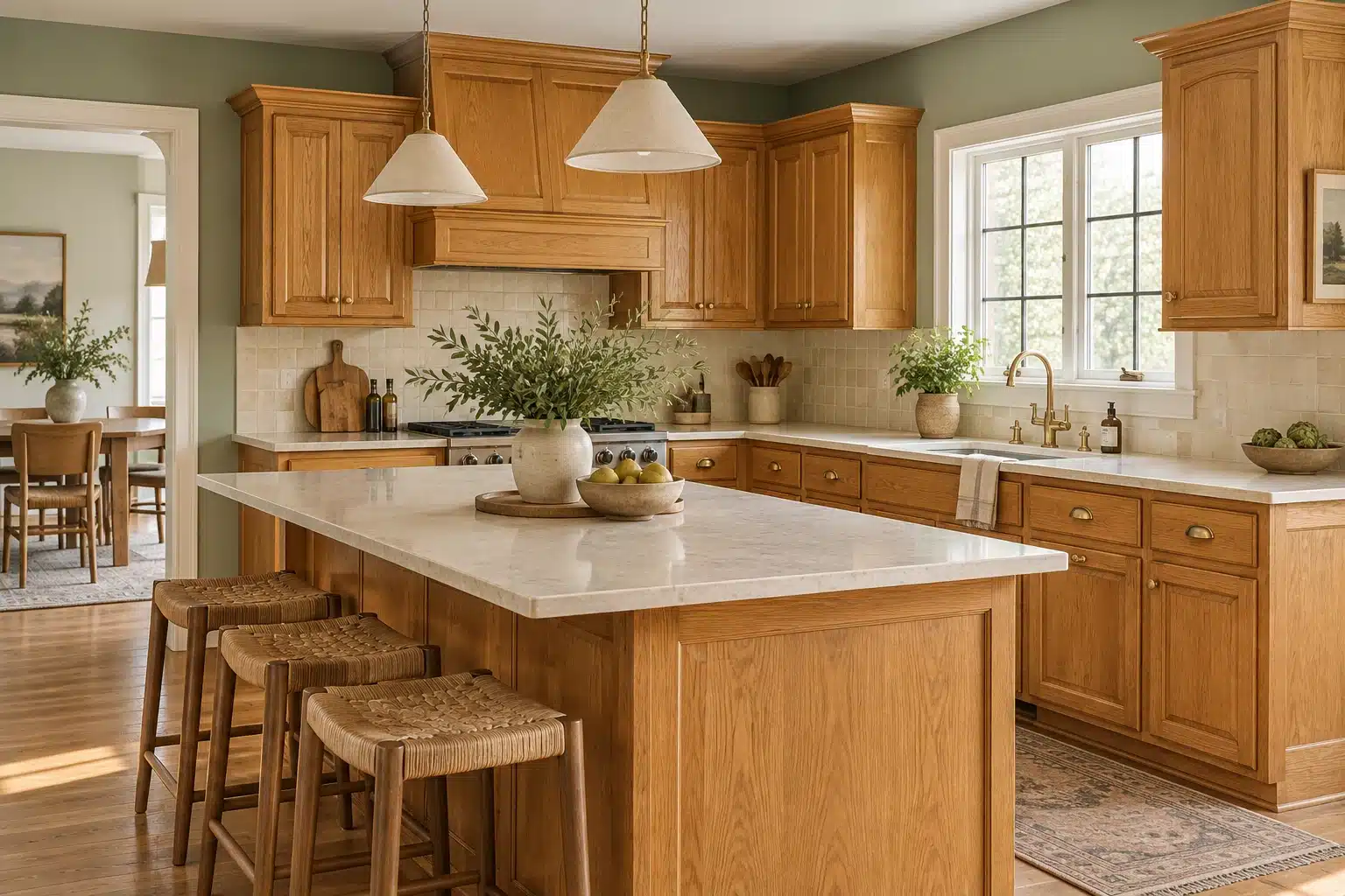
Paint Colors for Honey Oak Cabinets: 6 Palettes to Try
Good paint colors for honey oak cabinets include warm off-white, soft beige, muted sage, mushroom and dusty blue. As part of our painting resources, this guide starts with the countertop and backsplash you are keeping, then decide whether you want the wood to blend into the room or stand out. No wall color can remove an oak cabinet’s orange or yellow finish, but a well-chosen backdrop can make the combination feel deliberate.
You do not have to paint perfectly useful cabinets just because the kitchen feels dated. Sometimes the better move is smaller: change the wall color, simplify the competing finishes and let the wood be wood. The six palettes below are Cardinal Decor design suggestions, not promises that one paint will suit every kitchen.
Choose Your Direction Before Choosing a Paint
Put a white sheet of paper beside a cabinet door, your countertop and the backsplash. Look for the strongest color relationships: golden wood beside cream tile, orange wood beside gray stone, or reddish wood beside a pink-beige counter. The paper is a comparison aid, not a calibrated color test.
Sherwin-Williams explains that comparing colors side by side helps reveal undertones, and that daylight and electric lighting affect their appearance. Its color guidance also distinguishes balancing warm wood with a cooler color from deliberately repeating its warmth. See Understanding Undertones to Choose the Right Color.
For this kitchen, make one decision first: blend or contrast? A beige-and-cream scheme is a sensible starting point for a quieter room. Sage or dusty blue is worth testing when you want a more visible color relationship. Do not expect blue to make orange-toned wood disappear; the contrast may make the cabinet color more noticeable.
Six Color Palettes to Try With Honey Oak
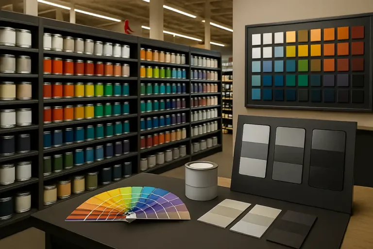
These are color families to sample, not exact manufacturer matches. The swatches are approximate screen illustrations. Use physical samples to choose the final paint.
Warm Off-White + Oatmeal + Aged Brass
Muted Sage + Cream + Soft Black
Soft Beige + Linen + Warm White
Mushroom + Ivory + Dark Bronze
Dusty Blue + Chalky White + Warm Wood
Olive + Cream + Terracotta
1. Warm Off-White, Oatmeal and Aged Brass
Start here if you want the cabinets to feel familiar and the rest of the kitchen to feel quieter. Try a restrained off-white wall, oatmeal textiles and a small amount of aged brass. Keep the backsplash and wall sample beside each other: an off-white that seems pleasant alone may look yellow next to a cooler white tile.
This is our first palette to test when the room already has cream counters or warm stone. If your appliances and backsplash are crisp white, compare a less creamy off-white too. You are looking for a comfortable relationship, not three almost-matching whites that look accidental.
2. Muted Sage, Cream and Soft Black
For an earthy kitchen, test a subdued sage wall with cream accents and limited soft-black details. Think of a simple black frame or light fitting, rather than changing every piece of hardware at once. A gray-green sample and a yellow-green sample can produce quite different results beside the same cabinet.
Our preference is to begin with a muted shade so the wall does not compete with a busy oak grain. If the room has a greenish stone counter, check that the two greens work together. The cabinet is only one part of the decision.
3. Soft Beige, Linen and Warm White
This is the low-contrast route. Use the wall to bridge the wood and pale surfaces, then add texture through linen, woven shades or simple pottery. It is especially worth trying when warm flooring, cabinets and counters already share the room.
Avoid selecting a beige merely because the name sounds neutral. Compare it with the counter from the doorway as well as up close. If a sample looks pink beside your finishes, decide whether you actually like that effect before committing.
4. Mushroom, Ivory and Dark Bronze
A brown-gray mushroom can create a more subdued backdrop than cream. Pair it with ivory accents and a restrained dark metal finish. This is our suggested starting point for someone who likes neutral rooms but finds a pale beige scheme too uniform.
Test lighter and deeper versions. A midtone wall may look handsome in a bright kitchen but feel heavier beneath a long run of upper cabinets. If the sample seems muddy, try a cleaner neutral before buying a whole-room quantity.
5. Dusty Blue, Chalky White and Warm Wood
Choose this direction if you are happy for the oak to be visible. A muted blue backdrop can create an intentional warm-and-cool pairing. Start with a small sample rather than assuming that any blue-gray will calm the wood.
Keep the other choices simple: a quiet white accent, modest hardware and textiles that repeat one existing color. If the wood suddenly seems too orange beside the blue, that is useful feedback. Move toward a quieter blue-green or return to the low-contrast neutral options.
6. Olive, Cream and Terracotta Accents
For a richer look, test olive on the walls and keep larger pale surfaces simple. Add terracotta through a pot, bowl or textile so it is easy to change. This palette deliberately welcomes warmth rather than trying to conceal every trace of it.
A deep olive can be a strong choice for someone who wants an enveloping kitchen. If that is not the mood you want, test a lighter olive first. You do not need a dark room to prove that you are brave with color.
Let the Countertop Break the Tie
For a cream-and-olive kitchen with oak cabinets, decide where the green will go before shopping. Cream walls with olive accents offer a smaller change; olive walls create a stronger backdrop. The comparisons below are starting points to sample beside your own finishes.
For related combinations beyond the kitchen, explore our rustic farmhouse paint palettes.
If two wall samples both look good beside the cabinet, choose between them at the countertop and backsplash junction. That is where several permanent finishes meet, and it is often where an almost-right color becomes distracting.
With a busy warm granite, our starting suggestion is a quiet off-white or beige. With cream tile, compare warm neutrals and muted greens. With a cool gray counter, test a gentle gray-green or blue-gray alongside a neutral option. These are starting points for comparison, not rules based only on a material name.
With an oak floor as well as oak cabinets, compare samples from across the room. The wall needs to work with the whole field of wood, including any difference between the floor finish and cabinet finish. A rug or runner can introduce a quieter patch of color without repainting either surface.
A Simple Sample Test Before You Buy Gallons
Choose three finalists, not twelve. Put each on a separate sample board following the sample product’s instructions. Label the back with the brand, color name and code so you can find the winner again.
Move the boards beside the cabinet, under the upper cabinets and near the adjoining room. Look at them in daylight and under the lights you actually use for cooking and eating. Our suggested test is to keep them in place for at least a full day so you see more than one lighting condition.
Write down three observations for each: how the oak looks, how the backsplash looks and whether you like the room from the doorway. Reject a color that only looks good in one photograph. For the wider sampling process, read how to choose paint colors for your room’s light.
Build the Whole Palette Without Replacing Everything
Choose the wall first, then repeat one supporting color in two small places. A linen shade and a tea towel can be enough. Before changing hardware, compare a sample finish against the existing faucet, hinges and appliances. Replacing one visible detail at a time lets you judge the effect.
If your kitchen still has several 1990s paint colors, you can keep one you love and quiet the surrounding palette. The goal is a kitchen you enjoy using, not a room that conceals the year it was built.
Once the color is chosen, use the Paint Calculator to estimate paint quantity from the wall area, coats and coverage you enter. Measure the surfaces you will actually paint. The calculator’s paint cost is not a contractor quote and does not include all preparation or supplies.
Questions About Honey Oak and Wall Color
What wall color makes honey oak look less orange?
Start by testing a low-contrast warm neutral if your goal is to draw less attention to the cabinet color. A cooler contrasting wall may make the orange more obvious. No paint choice changes the cabinet finish itself, and your counters, backsplash and lighting can change which option you prefer.
Can gray work with honey oak cabinets?
Yes, but gray is a family of colors, not one dependable match. Test it beside every fixed finish. If a gray sample looks chilly, purple or disconnected from the countertop, try a different undertone or compare a warmer neutral.
Should the trim match the wall?
It can, but it does not have to. If you are keeping existing white trim, include it in the sample test. If the trim is oak, keep it visible beside the wall sample as well. Choose a wall color that works with what stays before planning a larger repaint.
Do I need to paint the cabinets to update the kitchen?
No. If you like the wood and the cabinets work well, wall color, lighting and a few well-chosen details may be enough for the look you want. If you are weighing a cabinet repaint, compare the scope and preparation in our cabinet painting cost guide before making it part of the project.
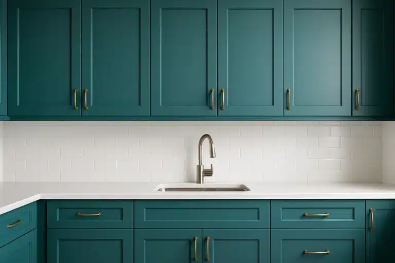
Featured image: AI-generated design illustration created for Cardinal Decor. It shows a suggested palette, not a photographed renovation or an exact paint match. Palette suggestions are editorial opinions; confirm colors with physical samples in your kitchen.