Rustic Farmhouse Paint Colors: 8 Warm Palettes That Feel Collected
Quick answer: The most useful rustic farmhouse paint colors are warm whites, creamy beige, mushroom, softened sage, aged olive, dusty blue, clay, and quiet charcoal. Part of our painting resources, this guide pairs those colors with the materials already in your home. The trick is not choosing colors that look “farmhouse” on a chip. It is building a palette that makes sense beside your wood floors, cabinets, stone, brick, metal, and natural light.
If you want a room that feels collected instead of staged, start with one calm wall color, one deeper grounding tone, and the finishes already attached to the house. Then bring in linen, wood, stoneware, aged metal, and a few darker notes.
What Makes a Paint Color Feel Rustic Farmhouse?
Rustic farmhouse color is usually quieter than it is bright. The palette tends to sit close to materials you already find in older houses and rural architecture: limestone, plaster, weathered wood, clay, iron, linen, faded indigo, moss, and cream.
BEHR’s modern farmhouse guidance uses the same broad color families, including warm whites, creamy beiges, soft greens, muted blues, and earthy browns. That is a useful starting point because it moves the style away from cold gray and toward warmer materials. See BEHR’s farmhouse color guidance.
The final result still depends on the room. Benjamin Moore notes that both the amount and direction of natural light affect how paint reads, while Sherwin-Williams points out that undertones can shift under natural and artificial light. Benjamin Moore room-direction guidance · Sherwin-Williams undertone guidance
8 Rustic Farmhouse Paint Palettes to Try
1. Warm Cream + Aged Olive + Natural Oak
Cream walls, an olive accent and visible oak
Warm cream
Aged olive
Natural oak
Illustrative palette, not manufacturer paint matches. Wood and leather blocks represent color families, not grain or texture. Compare physical samples with your room’s finishes and lighting.
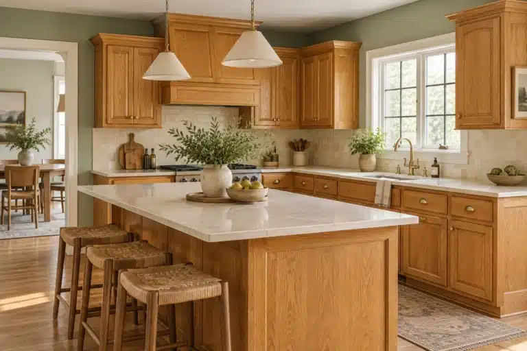
This is a good starting palette when the room already has honey oak, medium oak, butcher block, or warm pine. Cream keeps the walls light without feeling icy. Olive gives built-ins, cabinets, a door, or a small painted piece enough weight to keep the room from becoming beige from floor to ceiling.
- Main wall direction: warm cream or soft off-white
- Deeper color: aged olive
- Best material partner: natural oak
- Metal direction: aged brass, dark bronze, or blackened iron
Use this palette in kitchens, breakfast rooms, living rooms, or entries where the wood is meant to stay visible.
2. Mushroom + Walnut + Soft Black
Mushroom walls, walnut furniture and soft-black details
Mushroom
Walnut
Soft black
Illustrative palette, not manufacturer paint matches. Wood and leather blocks represent color families, not grain or texture. Compare physical samples with your room’s finishes and lighting.
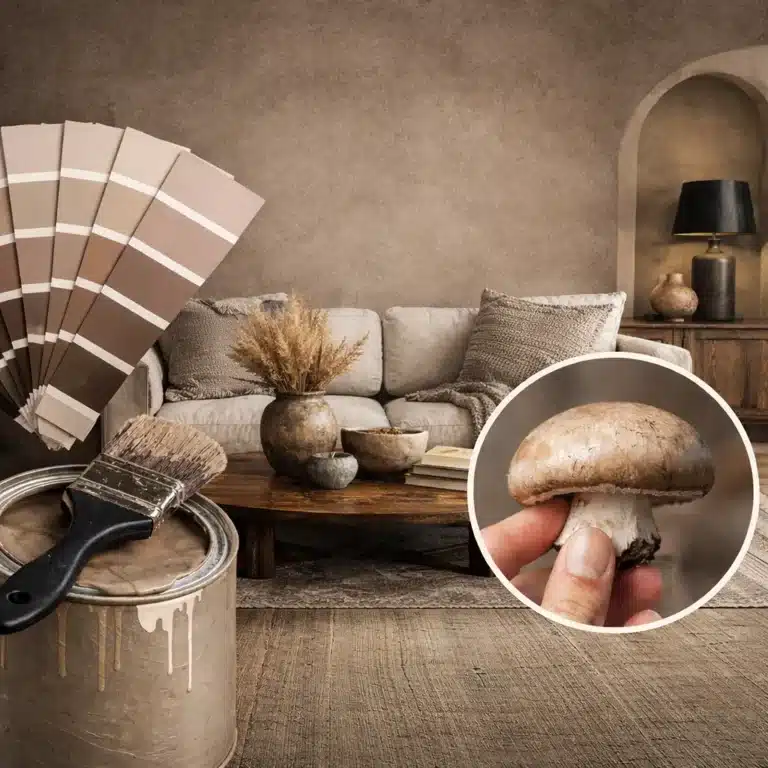
Mushroom works well when you want the room to feel warmer than gray but quieter than beige. It sits comfortably beside walnut, dark-stained wood, brown leather, and soft black.
The important part is testing the undertone. Mushroom can lean pink, green, taupe, or gray depending on the formula and the room. See the Mushroom Paint guide before choosing the final sample.
- Main wall direction: mushroom or earthy taupe
- Deeper color: soft black or charcoal-brown
- Best material partner: walnut
- Textile direction: oatmeal linen, brown wool, natural jute
3. Soft Clay + Warm White + Weathered Wood
Clay gives a farmhouse palette warmth without pushing all the way into orange or red. It works especially well when the room contains rough wood, old brick, terracotta, or warm stone.
Use clay as the wall color in a dining room or powder room, or keep it to cabinetry, an island, a pantry door, or a painted hutch. Pair it with a warm white that shares the same general undertone rather than a blue-white.
- Main wall direction: warm white or parchment
- Deeper color: muted clay
- Best material partner: weathered or reclaimed-looking wood
- Metal direction: iron, bronze, or aged brass
4. Slate Blue + Linen + Medium Oak
A muted slate blue can bring color into a farmhouse room without making the space feel coastal or overly traditional. Look for a blue with enough gray or green in it to sit comfortably beside natural wood.
North-facing light can make blue undertones more apparent. Sherwin-Williams recommends paying close attention to warm and cool undertones in north-facing rooms, and Benjamin Moore notes that direction and time of day can change how a color casts. Sample the blue on more than one wall before you commit.
- Main wall direction: muted slate blue
- Light companion: linen, ivory, or warm white
- Best material partner: medium oak
- Accent direction: charcoal, dark bronze, faded denim
5. Soft Sage + Cream + Brown Leather
Sage walls, cream textiles and brown leather
Soft sage
Cream
Brown leather
Illustrative palette, not manufacturer paint matches. Wood and leather blocks represent color families, not grain or texture. Compare physical samples with your room’s finishes and lighting.
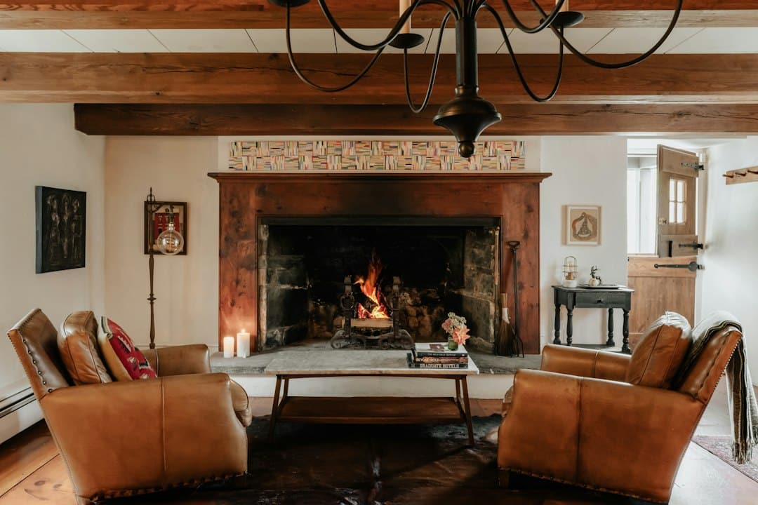
Sage works best when it feels dusty rather than minty. A muted green links naturally to wood, wicker, brown leather, warm stone, and botanical materials.
This is a useful palette for a kitchen with wood accents, a living room with leather seating, or a bedroom with cream bedding and natural-fiber rugs. If the sofa is your starting point, compare our farmhouse living-room palettes for brown leather sofas.
- Main wall direction: muted sage
- Light companion: cream
- Best material partner: brown leather or oak
- Deeper accent: olive or charcoal
6. Buttermilk + Tobacco Brown + Iron
Buttermilk is warmer and richer than a standard white. It can work well in rooms where white feels too sharp but you still want the walls to stay light.
Pair it with tobacco brown, dark wood, or iron so the room has enough contrast. This palette is especially useful in a dining room, mudroom, or kitchen with vintage-looking details.
- Main wall direction: buttermilk or creamy beige
- Deeper color: tobacco brown
- Best material partner: dark wood
- Metal direction: iron or dark bronze
7. Faded Denim + Warm White + Antique Brass
Faded denim gives you a familiar blue without the sharpness of navy. It works well on cabinets, built-ins, a pantry door, or an entire room when the saturation is softened.
Keep the white warm enough to work with the room’s wood and flooring. Antique brass adds a warmer reflection that keeps the palette from feeling cold.
- Main wall direction: warm white
- Deeper color: faded denim blue
- Best material partner: medium to dark wood
- Metal direction: antique brass
8. Plaster Beige + Charcoal + Aged Brick
If your house already has exposed brick, a brick fireplace, stone, or a darker floor, a plaster-like beige can quiet the wall without competing with those materials.
Charcoal adds structure to doors, hardware, windows, or a small piece of cabinetry. The palette works because the colors repeat what is already happening in the building materials.
- Main wall direction: plaster beige
- Deeper color: charcoal
- Best material partner: brick or stone
- Textile direction: flax, oatmeal, tobacco, faded rust
Choose the Paint Around the Wood You Already Have
Wood is one of the biggest fixed color fields in a farmhouse-style room. Floors, cabinets, beams, trim, doors, and furniture can carry yellow, orange, red, gray, or brown undertones.
You can either echo that warmth or deliberately balance it. Sherwin-Williams notes that undertones and lighting change how colors relate to one another, and that there is no single rule requiring warm and cool elements to be balanced in the same way for every room.
Honey Oak and Golden Wood
Warm cream, sage, olive, muted blue, and mushroom can all work. The best choice depends on whether you want to echo the warmth or cool it slightly. If honey oak is a major feature, see Paint Colors for Honey Oak Cabinets.
Walnut and Dark Brown Wood
Mushroom, plaster beige, cream, dusty green, and slate blue can keep dark wood from feeling heavy. Leave enough light contrast around the wood for the grain to stay visible.
Gray-Washed or Weathered Wood
Be careful with cool gray walls. A room with gray-washed wood can become flat when every surface sits in the same cool range. Warm white, clay, tobacco, muted green, or a warmer mushroom can give the wood more presence.
Room Direction Changes the Palette
Natural light is not neutral. A paint sample can look warm in one room and cooler in another.
North-Facing Rooms
North light often has a cooler cast. Sherwin-Williams recommends considering warmer undertones to counter that coolness. Warm cream, clay, mushroom, and softened olive are useful directions to sample.
South-Facing Rooms
South-facing rooms usually receive stronger, warmer natural light. Benjamin Moore notes that slightly deeper colors can help keep a bright room from washing out. This can be a good place to test mushroom, olive, slate blue, or clay.
East-Facing Rooms
East-facing rooms get stronger morning light and cooler, dimmer light later in the day. Test the palette at the time you actually use the room most.
West-Facing Rooms
West light changes noticeably through the day, often becoming warmer later. Sample the color in both the quieter morning light and stronger afternoon or evening light.
Trim Color: White Is Not the Only Answer
White trim still works beautifully in a rustic farmhouse room, but the white should relate to the wall color. Benjamin Moore recommends looking at the undertone of the wall when choosing trim white. Warm walls generally pair more naturally with warm whites.
You can also paint the trim the wall color and change the sheen. That gives old molding and door casings a quieter, more architectural appearance. For a stronger one-color treatment, see the Color Drenching guide.
What Sheen Works With Rustic Farmhouse Paint?
Sheen is a practical choice, not a style label. The correct finish depends on the surface, paint line, wear, cleaning needs, and the look you want.
Benjamin Moore notes that satin, semi-gloss, and high gloss are common trim choices because higher sheens are more durable and washable. In a very bright room, a lower sheen on trim can reduce reflection and keep the room softer.
For walls, start with the paint manufacturer’s recommended finishes for the room and surface. See Paint Types & Finishes for the full comparison.
How to Test a Farmhouse Paint Palette
- Pull together the fixed finishes first: flooring, cabinets, counters, brick, stone, and large wood pieces.
- Choose two or three wall-color directions rather than twenty near-identical samples.
- Place large samples on more than one wall.
- Check the samples in morning, afternoon, and evening light.
- Turn on the lamps and overhead lighting you use at night.
- Hold the trim color beside the wall sample.
- Check the color next to the actual wood, stone, tile, and fabrics that will stay in the room.
Benjamin Moore recommends observing paint samples in both natural and artificial light through the day. That simple step matters more than choosing a color because it looked good in someone else’s photograph.
How to Keep Rustic Farmhouse From Feeling Too Themed
- Use fewer signs, slogans, and small decorative objects.
- Let wood, stone, linen, ceramic, and metal provide texture.
- Repeat colors in different materials rather than buying a matching set.
- Choose one deeper paint tone instead of several accent colors.
- Leave some walls visually quiet.
- Mix older-looking pieces with clean-lined furniture so the room does not feel like a period set.
- Keep the palette tied to permanent materials in the house.
Plan the Paint, Then Shop the Finishing Layer
Once you have the palette direction, calculate the paint before buying decor around it.
- Use the Paint Calculator
- Choose Paint Colors for Your Room’s Light
- Compare Paint Types and Finishes
- Shop the Rustic Farmhouse Paint & Decor Edit
Rustic Farmhouse Paint Color FAQs
What are the best rustic farmhouse paint colors?
Warm whites, creamy beige, mushroom, sage, olive, dusty blue, clay, and charcoal are useful color families to sample. The strongest choice depends on the wood, flooring, stone, light, and permanent finishes in the room.
Does farmhouse decor have to use white walls?
No. White is one option. Mushroom, sage, blue, clay, beige, and olive can all create a farmhouse feel when they work with the room’s materials.
What colors work with rustic wood?
Warm cream, mushroom, muted green, softened blue, clay, and charcoal can all work with rustic wood. Start by identifying whether the wood leans yellow, orange, red, gray, or brown.
Are gray farmhouse walls outdated?
Gray can still work when it suits the room. The problem is not the color family itself. A cool gray can feel disconnected in a room dominated by warm wood, cream textiles, aged brass, and earthy materials. Test warmer gray, mushroom, or taupe directions if the existing gray feels cold.
Should farmhouse trim always be white?
No. White trim can work, but so can wall-color trim, dark trim, or natural wood. If you choose white, check that its undertone works with the wall color.