90s Paint Colors: 8 Iconic Shade Pairs and How to Use Them Now
90s paint colors are back in a more edited form. Designers are revisiting taupe and beige, burgundy, hunter green, buttercream, and sage while using contemporary finishes and quieter pairings. Recent coverage from Better Homes & Gardens, ELLE Decor and Homes & Gardens documents the broader 1990s revival, so this guide focuses on how those familiar color families are being updated rather than claiming every 1990s shade is trending.
The good news: these 90s colors can come back without the dated vibe. However, the trick is how you use them: upgraded finishes, smarter scale, and better pairings.
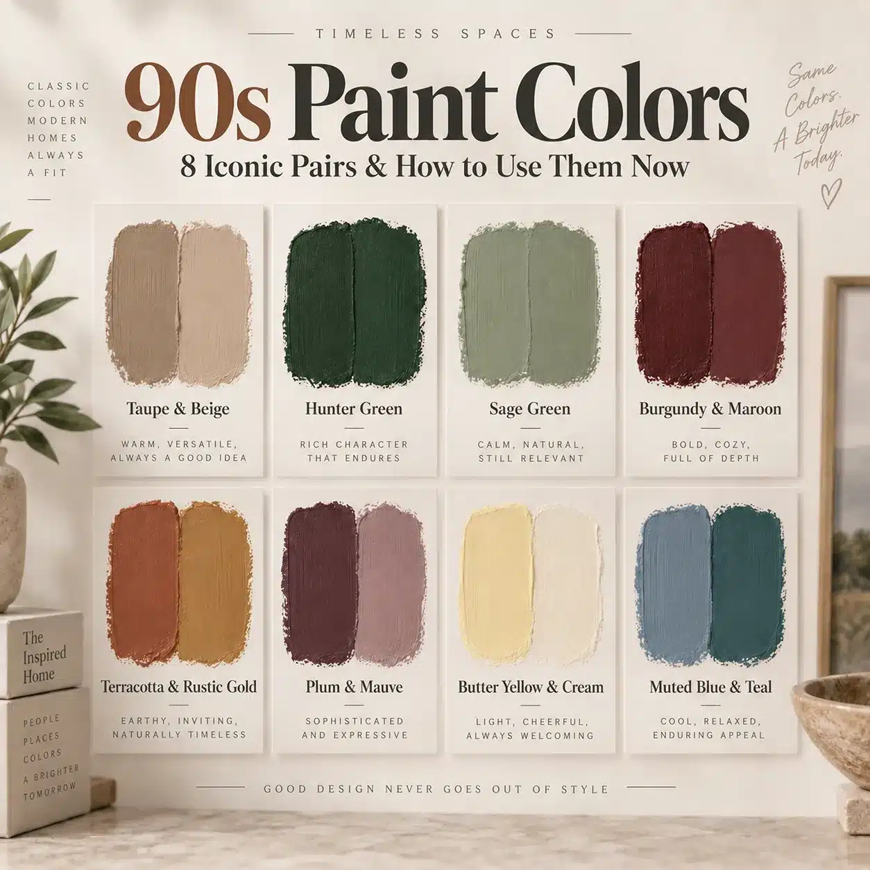
Quick answer: The most recognizable 90s paint colors include warm beige and taupe, hunter green, sage, burgundy, terracotta, plum, butter yellow, and muted blue or teal. Five of those color families are appearing again in current design coverage, while the others round out the period palette.


What Colors Were Popular in the 90s?
The 1990s did not have one single paint palette. Warm neutrals, earthy reds, sage, rustic gold, and terra cotta were common, while deeper teal, blue, and plum also showed up in more saturated rooms. Sherwin-Williams’ 1990s color archive says beige dominated the decade and highlights putty, sage, rustic gold, terra cotta and earthy reds. Dunn-Edwards’ 1995 palette adds saturated teal, plum, blue, and deep red to the picture.

| 90s color family | How it showed up then | How to use it now |
|---|---|---|
| Warm beige, taupe and putty | Whole rooms and builder neutrals | Use as a warmer architectural neutral with wood and stone |
| Hunter and forest green | Dining rooms, kitchens and traditional spaces | Try cabinetry, trim or a color-drenched room |
| Sage green | Muted walls, textiles and country-inspired rooms | Treat it like a soft neutral and add texture |
| Burgundy and deep red | Accent walls and formal rooms | Use in a small room, dining space or built-in |
| Terracotta and rustic gold | Tuscan-influenced interiors | Bring it in through smaller painted surfaces or warm accents |
| Plum and mauve | Bedrooms, florals and moody decorative schemes | Choose dustier versions with warm wood and simple furnishings |
| Butter yellow and cream | Kitchens, living rooms and cheerful accents | Use on doors, furniture or a small room instead of every wall |
| Muted blue and teal | Eclectic rooms and deeper wall colors | Use on cabinetry, built-ins or one focused wall |
Actual 1990s Paint Colors From Brand Archives
If you want period references instead of a modern approximation, paint-company archives give us named examples. Sherwin-Williams lists Bungalow Beige SW 7511, Urban Putty SW 7532, Svelte Sage SW 6164, Fireweed SW 6328 and Spiced Cider SW 7702 in its 1990s collection. Dunn-Edwards’ 1995 archive includes Sunflower DE5391, Aquatic DEA134, Putnam Plum DEA100, The Blues DE5859, Boat Anchor DE6377 and Crimson Strawberry DEA102.
These archived colors make the decade easier to understand: warm neutrals and earth tones were only part of the story. Saturated plum, teal, blue and red belonged there too.
The five shades below are the strongest comeback colors in current decorating coverage. Three more period colors follow so you can see the broader 90s palette rather than a five-color trend list.
Before choosing from this 90s color palette, check how the room changes through the day. The guide to picking paint colors for your room’s light will help you catch undertones that can shift beige, green, plum and blue once they are on the wall.
1) Taupe + Beige: the quiet flex, not the builder basic

90s colors taupe and beige used to get flattened into “builder-grade.” Now they’re back as warm, architectural neutrals that feel expensive thanks to their depth. The big shift is texture. Modern designers are swapping dated stucco and sponge painting. They opt for limewash and clay plaster to create soft movement and a chalky matte finish.
Do this (the updated look):
- Choose a limewash or clay-plaster style finish for walls so the color changes gently with the light
- Keep the room calm: warm neutral walls, layered textiles, a few sculptural pieces. Let the finish do the heavy lifting
- Pair with materials that feel real: white oak, travertine, linen, bouclé, unlacquered brass, aged wood
Skip this (the throwback trap):
- Sponge painting and heavy mottled textures that read visually “busy”
Fast room win: Paint a small hallway in a taupe limewash finish. Add a single statement sconce on a dimmer. It’s slightly extravagant for a hallway. That’s why it looks like a designer did it.

2) Burgundy + Maroon: drama that feels calm (yes, really)

In the 1990s, these deep tones often showed up as plum and contrast-heavy “statements.” The modern version leans into richer red undertones and uses one power move: color drenching.
Color drenching involves painting walls, trim, cabinetry, and even the ceiling in the same shade. This technique reduces visual breaks. It makes the room feel cohesive.
Do this:
- Use color drenching in a library, bedroom, or powder bath for a moody, cohesive sanctuary feel
- Balance the depth with warm flooring tones and metallics (think fawn-toned wood, antique brass, or soft gold)
Skip this:
- Leaving the room unbalanced. These 90s colors need counterpoints like hardware and lighting so they feel grounded, not heavy
Designer trick: repeat the burgundy once more in the room (a single velvet pillow, a small piece of art). Two echoes look intentional. Ten looks like a theme party.

3) Hunter Green: go big, ditch the shiny brass

Hunter green is back in our 90s colors revival because it has longevity and weight. Designers are even pushing an all-in approach: walls, trim, and ceiling for full impact.
The detail that decides whether it feels modern or stuck in the past: hardware. In the ’90s, hunter green plus high-shine polished brass was a common pairing. The modern move is aged or hammered brass that absorbs light and feels tactile.
Do this:
- Use hunter green at full scale (walls + trim + ceiling) for a cocoon effect
- Pick aged or hammered brass, not mirror-shiny finishes
- Add texture, not pattern overload: grasscloth, wool, leather, linen, raw wood
Skip this:
- Thin little accent strips or wallpaper borders that scream “1997”
Quick upgrade: swap one set of knobs or pulls to aged brass. It’s a small, “why did I spend money on that?” choice that makes the whole green moment look curated.

4) Buttercream Yellow + Gold: the warm pop that won’t exhaust you

These 90s colors are sunny hues. They’re returning with a warning label: the old Tuscan-era total immersion burned people out. The modern strategy is curation, not saturation.
Do this:
- Use buttercream as a soft focal point, not an everywhere color
- Bring gold or buttercream in through a single vintage piece, a painted door, or a statement ceiling
- Start small with 90s colors if you’re nervous: one furniture piece beats repainting an entire room
Skip this:
- Painting whole rooms in high-intensity yellow tones
Easy, high-impact idea: Paint an interior door buttercream. Add aged brass hardware. Keep the surrounding walls warm white or taupe. It reads “collected,” not “committed.”
5) Sage Green: the “cool neutral” with a texture rule

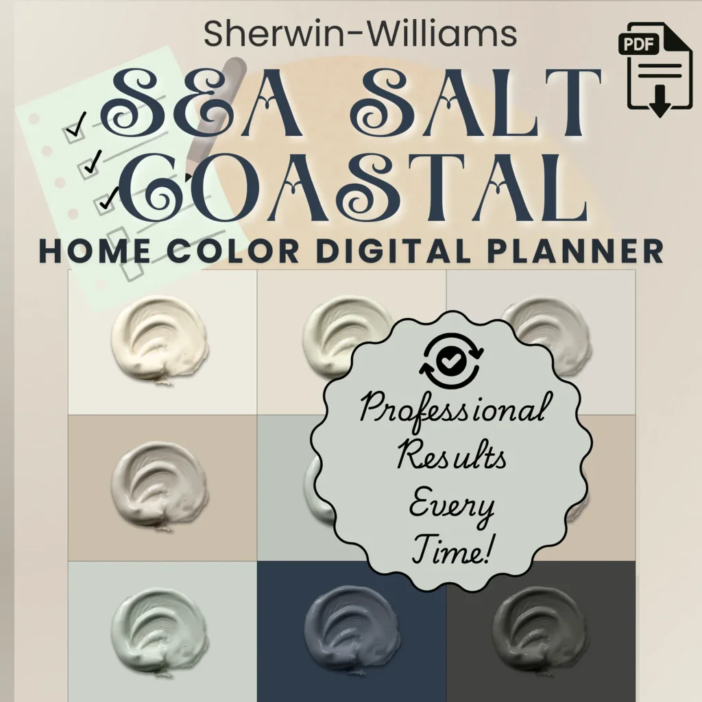
Sage is one of the 90s colors back as the grounded, approachable green that still feels current. The modern rule is echoing. It repeats the color through different materials. This ensures it doesn’t feel like a flat coat of paint.
Do this:
- Paint the walls sage, then echo it in tile, linens, velvet, ceramics, or upholstery
- Mix eras on purpose: sage walls with mid-century pieces and clean modern silhouettes keeps it from feeling like a time capsule
Skip this:
- Sage in isolation with nothing else repeating it. It can fall flat fast
Texture swap that works: trade faux texture tricks for real materials. Handmade tile, nubby fabric, natural fibers. The room feels cozy, but cooler.
6) Terracotta + Rustic Gold: the warm 90s pair worth editing down
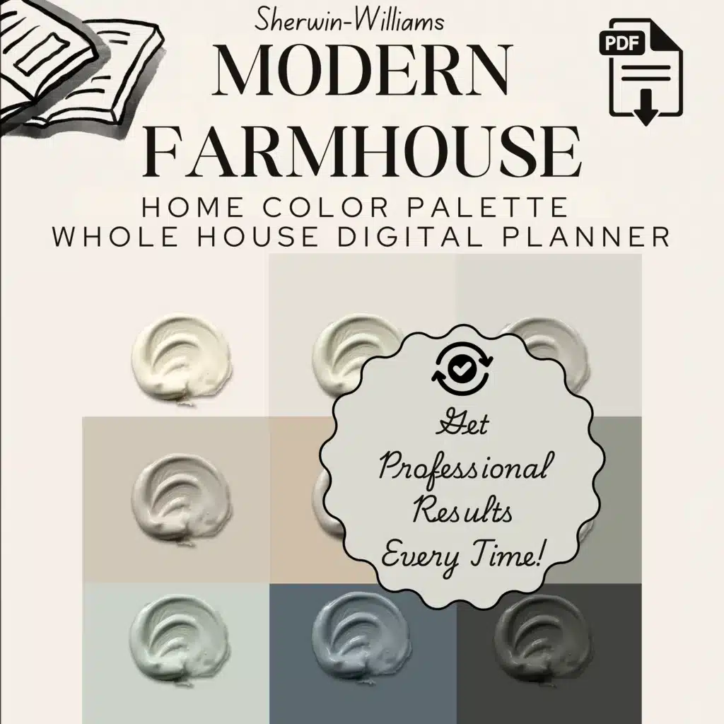
Terracotta and rustic gold are part of the documented 1990s palette, especially alongside beige, putty and warm wood. The dated version piled several Tuscan cues into the same room. The better version picks one warm note and gives it room to breathe.
Try it now: a terracotta powder room, a muted ochre door, a clay-toned built-in or a warm accent wall against natural wood and cream.
7) Plum + Mauve: moodier than millennial pink
Dunn-Edwards includes Putnam Plum in its 1995 decade palette, a useful reminder that 90s rooms were not all beige and green. Plum, mauve and dusty berry shades worked with warm woods, florals and layered textiles.
Try it now: choose a browned or dusty plum instead of a candy-bright purple. It works especially well in bedrooms, dining rooms and small rooms where a darker paint color can feel intentional.
8) Muted Blue + Teal: the overlooked side of the 90s palette
Teal and deep blue also belonged to the decade. Dunn-Edwards’ 1995 archive includes Aquatic, The Blues and Boat Anchor, showing how saturated cool colors sat beside the warmer earth tones people often remember first.
Try it now: use a softened teal or smoky blue on cabinetry, a bookcase, a mudroom or one wall, then keep the surrounding materials simple.
The 3 rules that make all the 90s colors feel expensive now
If you only remember three things about bringing back 90s colors, make it these:
- Update the finish, not just the hue. Depth comes from materials like limewash or clay plaster, not only pigment
- Choose your scale on purpose. Go big with color drenching for calm drama, start small with golds and yellows
- Mix your eras. Antiques plus modern pieces feels collected, not staged
What Wall-Painting Techniques Were Popular in the 90s?
Color was only half the story. Sponge painting, rag rolling, color washing and other faux finishes were common ways to add visible texture and variation to walls. If you remember mottled walls that looked intentionally uneven, that was often the point.
For a current room, the easier move is usually to keep the 90s color and simplify the finish. A soft limewash effect, matte paint or one carefully chosen textured wall can reference the decade without recreating every decorative technique at once. If you are choosing sheen at the same time, use the paint types and finishes guide before you buy.
Was Hunter Green a 90s Color?
Yes. Hunter and forest greens were closely associated with 1990s interiors, especially when paired with burgundy, warm wood and traditional furnishings. If you want the color without the time-capsule effect, pair it with cleaner lines, quieter hardware and fewer competing patterns.
Ready to Paint? Estimate the Amount Before You Buy
Once you have narrowed down the color, use the Cardinal Decor Paint Calculator to estimate how many gallons your room needs. Save or print the estimate before shopping so the color decision turns into a usable project plan.
If the softer side of the decade is what you like most, compare the Warm Neutral Paint Colors guide. For sage, cream, clay, dusty blue, and wood-heavy rooms, see Rustic Farmhouse Paint Colors.
A simple “pick your project” cheat sheet
- Want a low-risk 90s colors revival upgrade?
Buttercream door or gold vintage accent - Want a high-end statement that still feels calm?
Burgundy or maroon color drenching in a small room - Want a rich, moody room that looks designer-fast?
Hunter green all-in + aged or hammered brass - Want warm, timeless “expensive neutral” energy?
Taupe or beige with a limewash or clay-plaster vibe