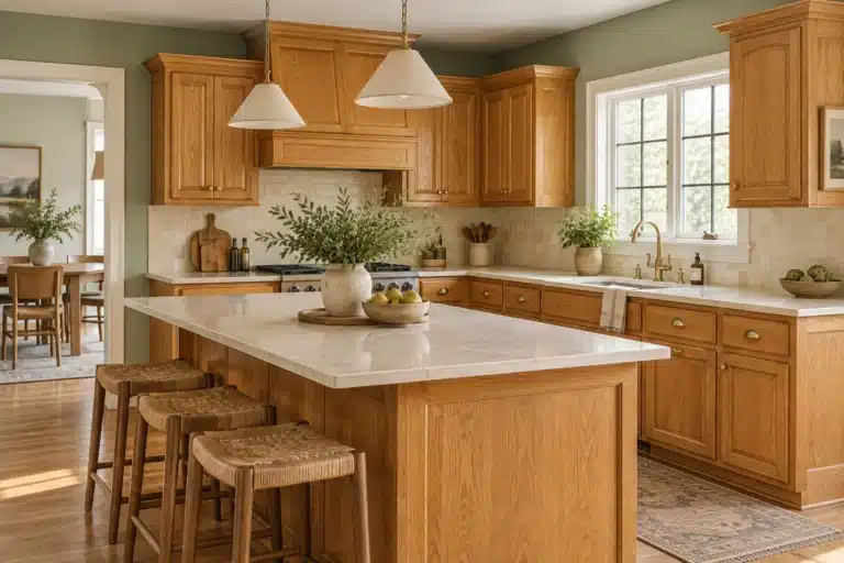
Warm Neutral Paint Colors: 7 Palettes Beyond Beige

Quick answer: Warm neutral paint colors sit between crisp white and saturated earth tones. Part of our painting resources, this guide helps you compare their undertones with the wood and finishes in your home. Think mushroom, oatmeal, putty, sand, camel, warm greige, soft taupe, and plaster beige. The best palette uses enough contrast to keep the room from looking flat, while still letting wood, stone, fabric, and metal carry much of the visual interest.
A warm neutral room should not be a stack of nearly identical beige surfaces. It needs light and dark values, varied textures, and a clear relationship between the paint undertone and the permanent finishes already in the room.
What Counts as a Warm Neutral Paint Color?
A warm neutral can lean beige, brown, taupe, red, yellow, or muted green while still reading as calm and low-saturation. The undertone is what separates one neutral from another.
Benjamin Moore notes that natural and artificial light can push undertones warmer or cooler, and Sherwin-Williams gives the same warning about room direction and bulb temperature. That is why a warm neutral that looks perfect online can turn pink, green, gray, or yellow in a different room. Benjamin Moore warm-and-cool color guidance · Sherwin-Williams undertone guidance
7 Warm Neutral Paint Palettes That Do Not Feel Flat
1. Mushroom + Oatmeal + Walnut
Mushroom is one of the easiest ways to get depth without committing to a dark wall. It often sits somewhere between taupe, beige, and gray, with undertones that shift with light.
- Wall direction: mushroom
- Light textile: oatmeal
- Dark anchor: walnut
- Metal direction: antique brass or dark bronze
This palette works well in living rooms, bedrooms, and dining rooms where the furniture already includes brown wood or leather. For a deeper look at this color family, see Mushroom Paint.
2. Warm Cream + Camel + Dark Bronze
Warm cream keeps a room light without the sharpness of a cool white. Camel adds a mid-tone that works well in leather, wool, curtains, or a rug. Dark bronze gives the palette a needed low note.
- Wall direction: warm cream
- Mid-tone: camel
- Dark anchor: dark bronze or espresso wood
- Texture: linen, wool, woven fiber
This combination is useful when the room gets limited daylight and you still want a light wall without making the room feel stark.
3. Soft Taupe + Ivory + Dark Walnut
Soft taupe can bridge warm gray and beige. Pair it with ivory so the light surfaces stay warm, then use dark walnut to create enough contrast.
- Wall direction: soft taupe
- Light companion: ivory
- Dark anchor: dark walnut
- Accent material: travertine, stoneware, or aged brass
This palette suits rooms with stone, medium-to-dark flooring, or substantial wood furniture.
4. Warm Greige + Terracotta + Oak
Greige can still work when it leans warm enough for the room. A muted terracotta accent stops the palette from becoming anonymous, while oak keeps the room connected to natural material.
- Wall direction: warm greige
- Accent direction: muted terracotta
- Wood: natural oak
- Light textile: flax or cream
If a greige sample turns cold beside your floors or cabinets, move toward mushroom, beige, or putty instead of forcing the color to work.
5. Sand + Aged Olive + Brass
Sand is a useful background when the room needs warmth but not a lot of color. Aged olive adds a natural deeper note, and brass reflects warm light without feeling too bright.
- Wall direction: sand
- Deeper color: aged olive
- Metal: aged brass
- Wood: medium oak or walnut
This palette works particularly well in kitchens, entries, and living rooms with natural wood.
6. Putty + Tobacco + Linen
Putty is a muted neutral that can lean gray, beige, or brown. Tobacco brings depth through leather, wood, or a darker painted piece. Linen keeps the softer surfaces light.
- Wall direction: putty
- Dark anchor: tobacco brown
- Light textile: linen
- Accent: blackened iron or bronze
This palette is strong in rooms that already have dark furniture but still need a lighter wall.
7. Soft Stone + Parchment + Cocoa
Soft stone sits close to beige-gray without reading as cold when the undertone is warm. Parchment lightens the palette, while cocoa adds a grounding brown.
- Wall direction: soft stone
- Light companion: parchment
- Dark anchor: cocoa
- Texture: boucle, wool, linen, ceramic
This is a useful palette when you want a quiet room with clear contrast but little obvious color.
How to Tell Whether a Neutral Is Actually Warm
Do not judge a neutral by its name. Compare it against a plain white sample, the flooring, the largest wood finish, and the countertop or stone in the room.
A neutral may reveal:
- yellow or gold undertones
- red or pink undertones
- green undertones
- violet undertones
- brown undertones
- gray undertones
Two beige paints can look almost identical on a small chip and separate dramatically once they cover a wall.
Room Direction Matters More Than the Pinterest Photo
Benjamin Moore’s room-direction guidance notes that natural light has a different cast depending on whether the room faces north, south, east, or west. Time of day and season change it further. See the room-direction guide.
North-Facing Rooms
North light can make colors read cooler. Warm cream, putty, mushroom, and beige with yellow or red warmth are useful directions to sample. A neutral with too much blue or green may feel colder than expected.
South-Facing Rooms
South-facing rooms generally receive stronger, warmer light. Benjamin Moore notes that slightly deeper colors can help prevent a bright room from washing out. Mushroom, taupe, warm greige, and soft stone can hold their shape well here.
East-Facing Rooms
East-facing rooms are brighter in the morning and often cooler later. If the room is mainly used in the evening, judge the sample in evening light rather than choosing it from a bright morning photograph.
West-Facing Rooms
West-facing rooms often gain strong warm light later in the day. Beige and cream can become more golden. Check the sample when the sun is strongest and again after dark.
Warm Neutral Paint With Wood Floors and Cabinets
Wood is rarely neutral. Oak, walnut, cherry, pine, and stained finishes all carry undertones that affect the paint around them.
Honey Oak
Honey oak carries obvious warmth. Warm cream, muted green, mushroom, and carefully chosen taupe can work well. For six focused palette directions, see Paint Colors for Honey Oak Cabinets.
Walnut
Walnut can handle lighter warm neutrals and deeper mushroom tones. Keep enough contrast between the wall and wood so the grain remains visible.
Light White Oak
Light oak can work with cream, sand, putty, soft stone, mushroom, and muted green. Compare the sample against the actual floor or cabinet because white oak can lean yellow, pink, or gray depending on finish.
Cherry or Red-Brown Wood
Test neutrals carefully around red-brown wood. Some pink or red undertones may amplify the wood color. A balanced mushroom, putty, or muted green can provide a calmer relationship.
Warm Neutral Walls With Stained Wood Trim
Use the wood you are keeping as the starting point. These are sampling directions, not guaranteed paint matches: compare each neutral with your actual casing, baseboards, flooring and largest upholstered piece before choosing.
| Existing wood trim | Wall colors to sample | What to compare in the room |
|---|---|---|
| Golden oak or honey-toned trim | Start with oatmeal, soft mushroom or a warm off-white. | Compare beside both the trim and the floor. Keep the sample only if you like how clearly the golden wood stands out. |
| Cherry or reddish wood trim | Try putty, restrained taupe and a warm stone neutral. | Compare against a cream sample as well. Choose the relationship you prefer rather than expecting wall paint to remove the wood’s red tone. |
| Dark walnut trim | Compare parchment, light mushroom and soft taupe. | View a full-height sample beside a doorway. Decide whether you want a light wall to emphasize the casing or a deeper neutral to soften the contrast. |
Sample the Wall Color Beside the Trim
- Prepare large movable sample boards using the paint maker’s recommended sample method. Label each color so you can compare consistently.
- Place each board directly beside a door casing, then above a baseboard and beside a window. Include a view where the flooring and trim meet.
- Compare in daylight and with the lamps you normally use. Check whether the wall and wood combination still feels right in the evening.
- Bring in a curtain, rug or upholstery sample before committing. For a brown leather sofa, compare the cream, mushroom and blue options in our farmhouse living-room color palettes.
If your wood trim continues into a kitchen with oak cabinetry, use our honey oak cabinet paint guide to compare the wall sample with the countertop and backsplash too.
Warm Neutral Trim Colors
A warm neutral wall does not require bright white trim.
Benjamin Moore recommends looking at the wall undertone when choosing a trim white. Warm walls usually sit more comfortably beside whites with related warmth. See Benjamin Moore trim guidance.
You can also paint the trim the wall color and vary the sheen. That keeps the room quieter and lets molding show through light rather than contrast. For a stronger one-color approach, see the Color Drenching guide.
How to Keep a Warm Neutral Room From Looking Beige Everywhere
The paint should set the background. It should not have to create every layer of interest.
- Use a dark wood, bronze, charcoal, or cocoa note for contrast.
- Mix smooth and rough materials.
- Pair linen with velvet, wool, leather, stone, or ceramic.
- Use one or two warm metals instead of several competing finishes.
- Repeat the wall undertone in small details rather than matching every object.
- Leave some negative space around furniture and art.
- Choose a rug with enough value contrast to separate it from the floor.
How to Sample Warm Neutral Paint Correctly
- Choose three or four distinct neutral directions, not ten nearly identical beiges.
- Place large samples beside the flooring, cabinets, counters, and main upholstery.
- Move the samples to more than one wall.
- Check morning, afternoon, and evening light.
- Turn on the lamps and overhead lights you actually use.
- Hold the trim white or trim color beside the sample.
- Photograph the room at different times, but make the final choice from the real sample, not the phone screen.
Benjamin Moore recommends viewing samples in both natural and artificial light through the day. Sherwin-Williams also notes that bulb temperature can alter how undertones appear.
Warm Neutral Paint in Dark Rooms
A light neutral is not automatically the best choice for a dark room. Some pale neutrals can turn dull when there is not enough light to support them.
Test warm cream, putty, mushroom, sand, and lighter taupe, then compare them with a slightly deeper sample. The deeper color may look richer rather than darker once the room’s actual light is involved.
For more help, see How to Choose Paint Colors to Brighten a Dark Room.
Plan the Paint Before You Buy the Decor
Once the palette is settled, estimate the paint and then build the finishing layer around it.
- Use the Paint Calculator
- Choose Paint Colors for Your Room’s Light
- Compare Paint Types and Finishes
- Shop the Warm Neutral Home Decor Edit
Warm Neutral Paint Color FAQs
What are warm neutral paint colors?
Warm neutrals are low-saturation colors with beige, brown, taupe, red, yellow, or muted green warmth. Common directions include cream, mushroom, putty, sand, camel, warm greige, and soft taupe.
Is beige the same as a warm neutral?
Beige is one warm-neutral family, but warm neutrals also include mushroom, taupe, putty, warm greige, soft stone, and other low-saturation colors.
What warm neutral works with dark wood?
Mushroom, cream, putty, soft taupe, sand, and warm greige can all work with dark wood. The best choice depends on the wood undertone and the room light.
Why does my beige paint look pink or green?
The undertone becomes more visible beside other materials and under different light. Compare the paint against a plain white sample and the room’s fixed finishes to identify what is shifting.
Do warm neutrals work with black accents?
Yes. Soft black or charcoal can provide useful contrast in a warm neutral room. Keep the amount controlled so the room still feels balanced.